Most renovations include tearing down walls to create open floor plans, but Lisa Rossman actually added a divider to maximize function in this 1970s home.
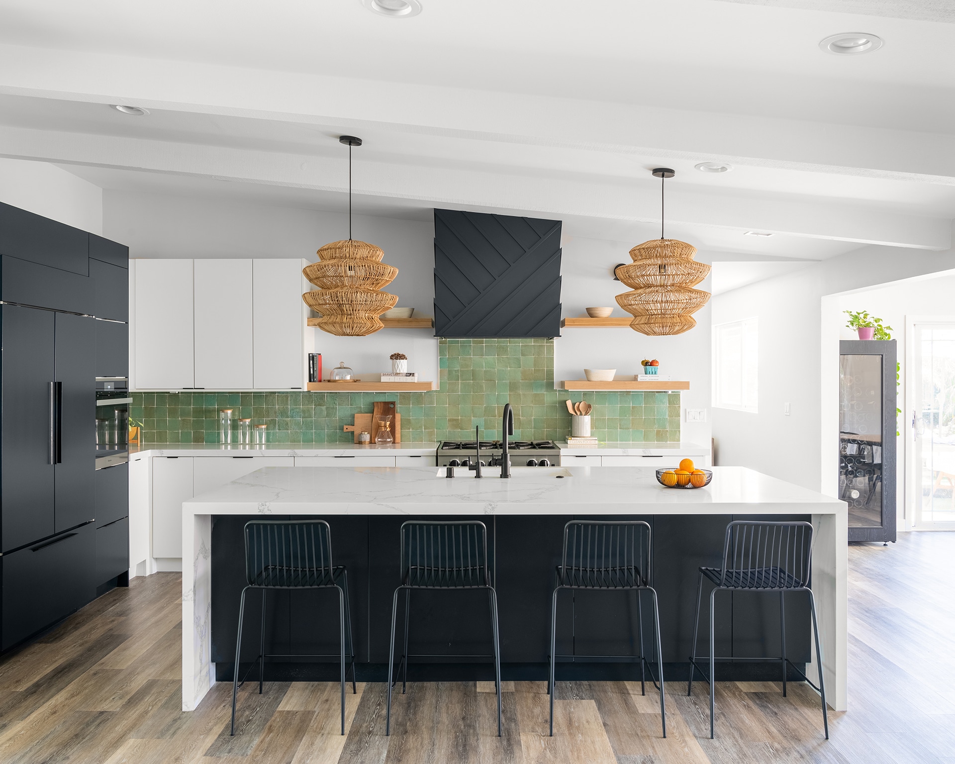
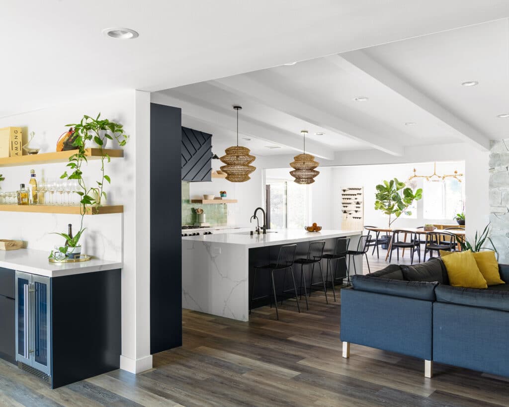
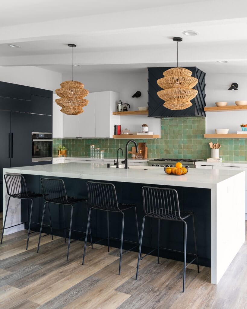
While the move may seem counterintuitive, Rossman’s renovation plan was the perfect solution for a family of five. The LL Design Co. founder leveled the massive great room, where awkward sets of steps had once disrupted the flow, and split it in half so every square inch could be utilized. She relocated the kitchen, which was once shoved into a tiny, back corner, to the center of the space and devised a U-shaped layout that now connects the culinary hub with distinct dining and living areas.
This airy-yet-delineated setup is now ideal for her clients as they’re able to entertain large groups, but they still have a sense of privacy. Most importantly, though, the updated interior and generous amount of seating means that they can eat all their meals together in a chic, modern atmosphere.
Finding Balance
When it came to the style of the project, Rossman was thrilled with the freedom she was given throughout the renovation to apply her signature blend of Scandinavian minimalism and California funk. “This family was a dream because they gave me full creative control,” she raves.
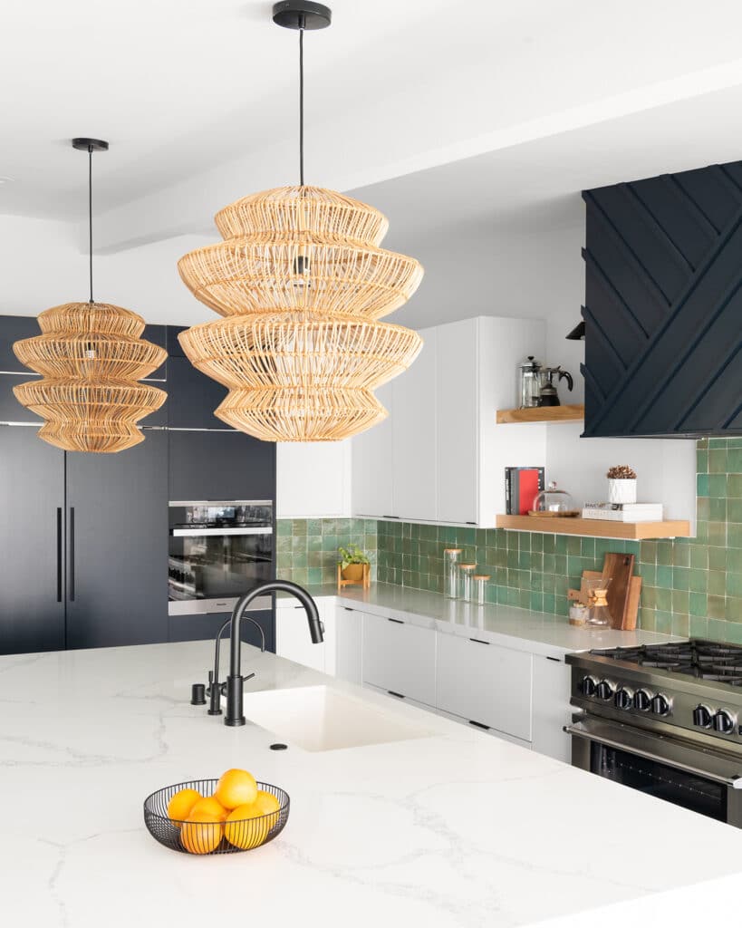
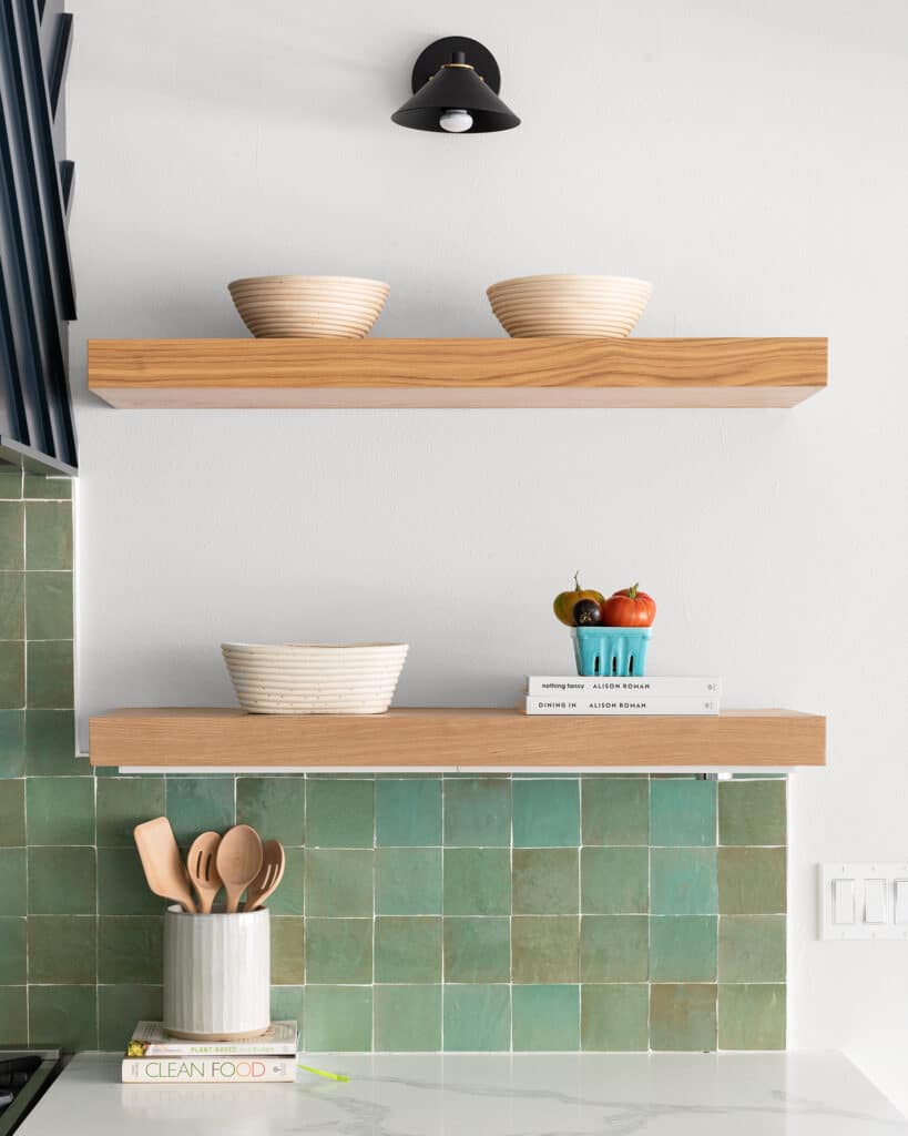
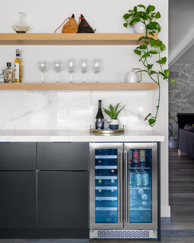
The Nordic influences are evident with white oak floating shelves and sleek Semihandmade DIY Slab cupboard fronts, which Rossman painted black and white for a stark contrast and adorned with metal tab pulls for a streamlined look. “Large bar handles start to busy up the cabinetry,” she explains. “Our whole vibe is very clean and contemporary. The panels are the statement instead of the hardware.
Design by LL Design Co.; Photography by Mike Radford
West Coast-inspired elements, like woven, beehive-like pendants and a seafoam-hued zellige tile backsplash that recalls the Pacific Ocean, evoke an organic breeziness that balances out the austere finishes. A custom range hood with a bold pattern and a bevy of potted plants are a nod to the Golden State’s playful aesthetic, as well.
Designing for a Crowd
The imposing island, with its veined countertops and dramatic waterfall edges, is more than just a striking focal point — it’s also a strategically designed piece. Rossman ensured it would be long enough for five wire counter stools and chose a material that would withstand wear. “I used Calacatta Colorado quartz for its durability factor because of the heavy use that their kitchen gets,” she reasons.
In the adjacent dining room, a sculptural chandelier hangs above a midcentury-style table from Article that can accommodate up to 15 people. Rossman picked it especially for dinners with extended family and friends, of which the homeowners host many. Its trendy, vintage feeling is just a plus.
Crafting Continuity
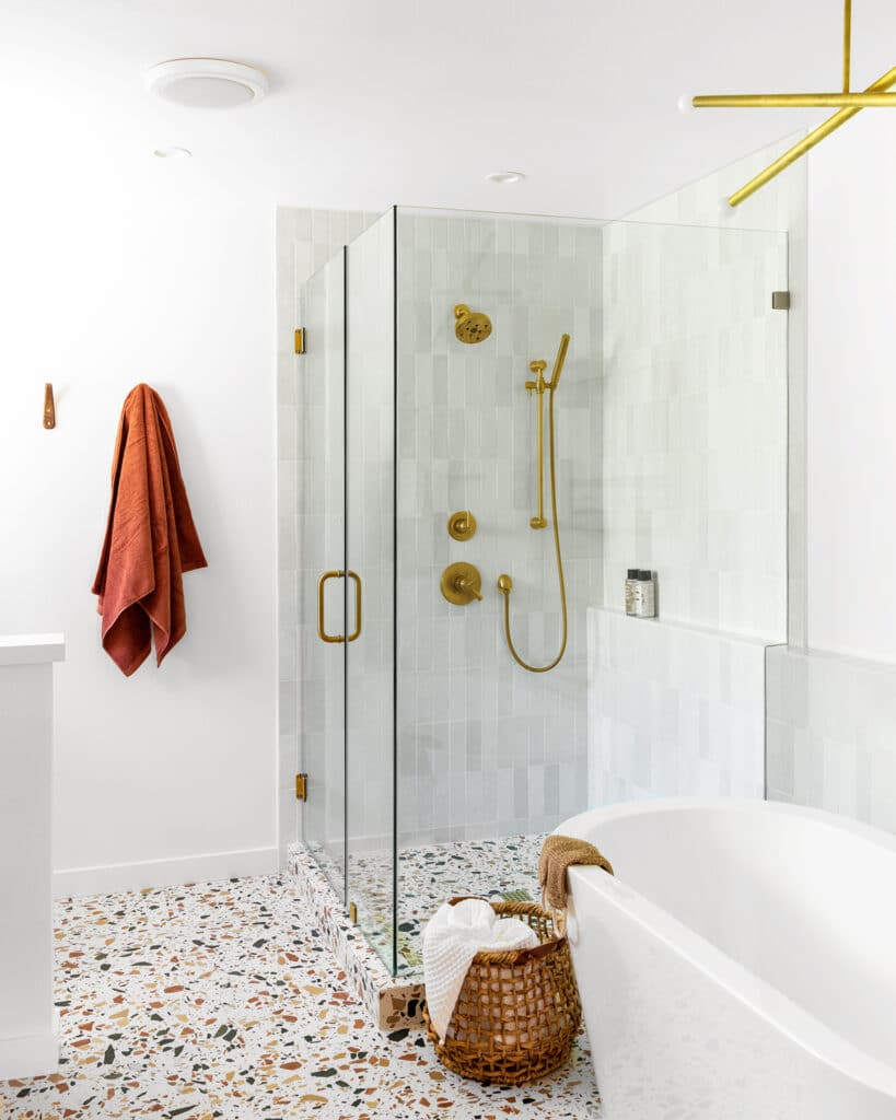
Though the warm tones of the main bathroom seem to be a departure from the cooler colors in the rest of the house, the ensuite offers subtle continuity that helps it fit right in. Burnt orange and turmeric yellow terrazzo flooring is paired with brass fixtures and a walnut vanity for a retro flare that echoes the dining room. At the same time, black accents like the custom barn door with a chevron detail match the dark, geometric features in the kitchen. The result is a harmonious home that hits so many different notes.
More Stories...
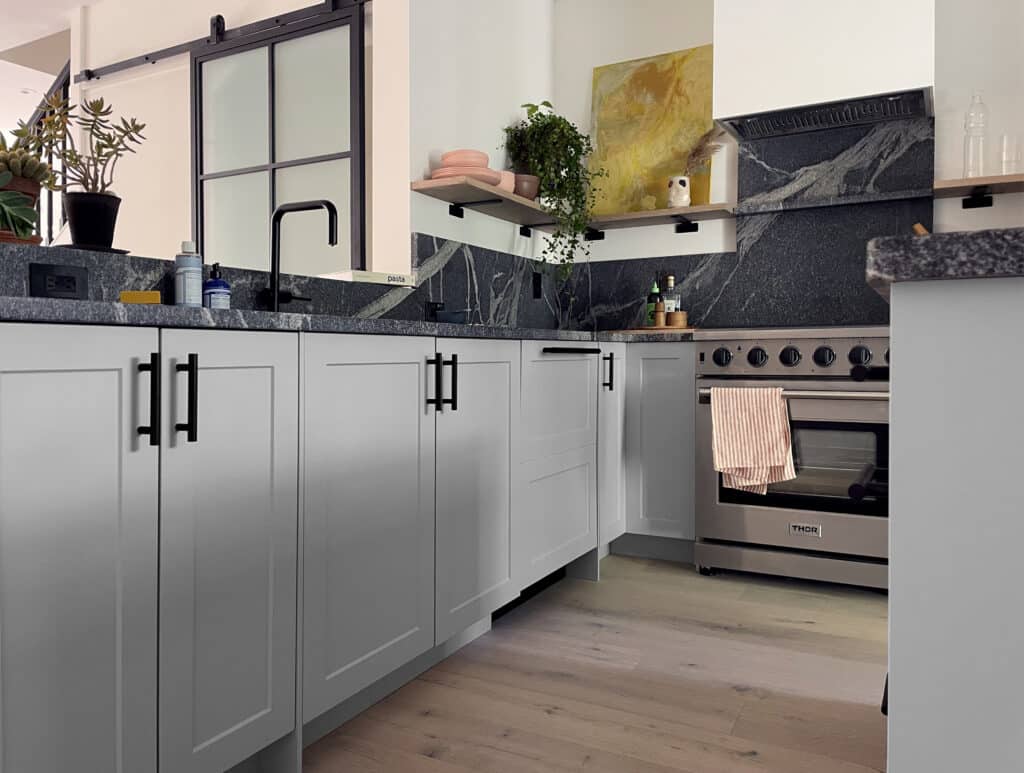
The space is decked out in Semihandmade Moss Quarterline and Tahoe.
House flippers and mom-daughter duo Lacey and Audrey Soslow created the kitchen of their (buyers’) dreams.
Malene Barnett teamed up with designer Leyden Lewis to create a space representative of her work.