As seasons come and go, trends invariably change: Millennial pink makes way for sage green, and gold and brass fixtures overtake silver. Sure, there are no rules saying you have to stick to what’s of-the-moment—in fact, it’s always better to go with what your heart truly desires, especially when you’re considering a major renovation—but still, trends are a great way to help you figure out what you might like in your own space. While 2022 is (shockingly) a few months away, we already have a good idea of the kitchen paint colors that will dominate the year—and they’re seriously inspiring.
If you’re starting to plan your own renovation, you’ve likely looked through plenty of paint cards, but maybe you haven’t yet settled on the perfect hue. Now, maybe you’ll lean towards a warm cream instead of a classic white, or you’ll venture out of your comfort zone with a bold blue. The choice, at the end of the day, is yours—but you can allow these 2022 kitchen paint color trends to give you a few ideas.

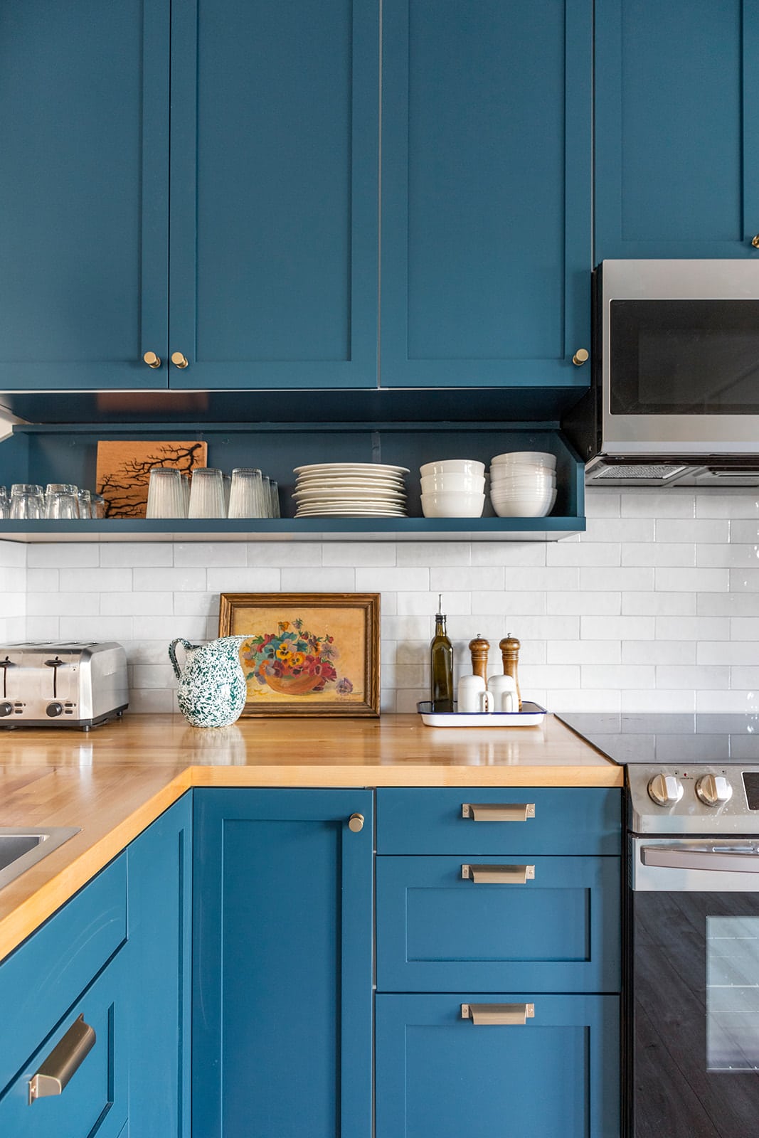
Deep Blue
Blue kitchen cabinets almost always result in a calming space, like these found in the Brown County Barn Burner, a rental property in Nashville, Indiana. To prevent the hue from overwhelming the space, go simple when it comes to the countertop and the backsplash. Here, classic subway tile and butcher block allow the Semihandmade DIY Shaker cabinets in Sherwin Williams Rainstorm to be the center of attention. Continuing the paint color on the open-front shelf makes the space look even more cohesive.
Design by Christa Martin; Photography by Sara Tramp
New Neutral
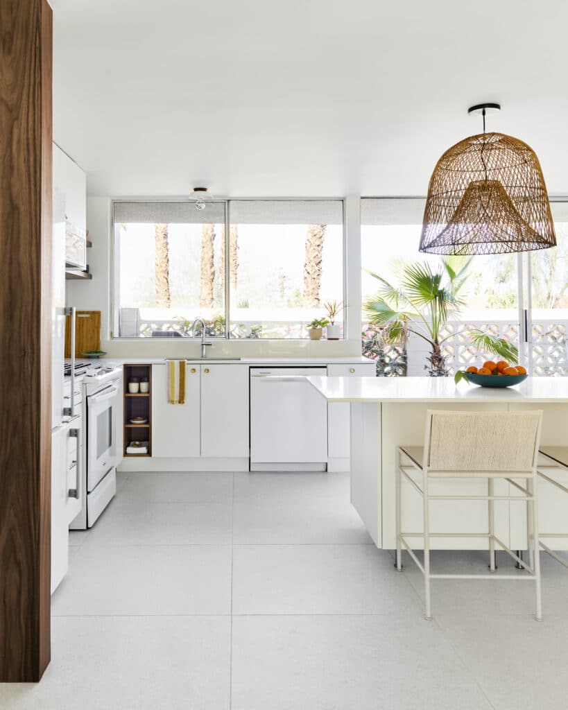
It doesn’t get much more classic than a simple white kitchen—but here, designer Christa Martin added a twist; cream-colored walls and a cream panel on the island add an ever-so-subtle contrast to the simple white slab cabinet fronts to her Sandpiper project in Palm Springs. Especially with the white, large-scale tile floor, this decision makes the space look and feel even more dynamic.
Design and Photography by Claire Thomas
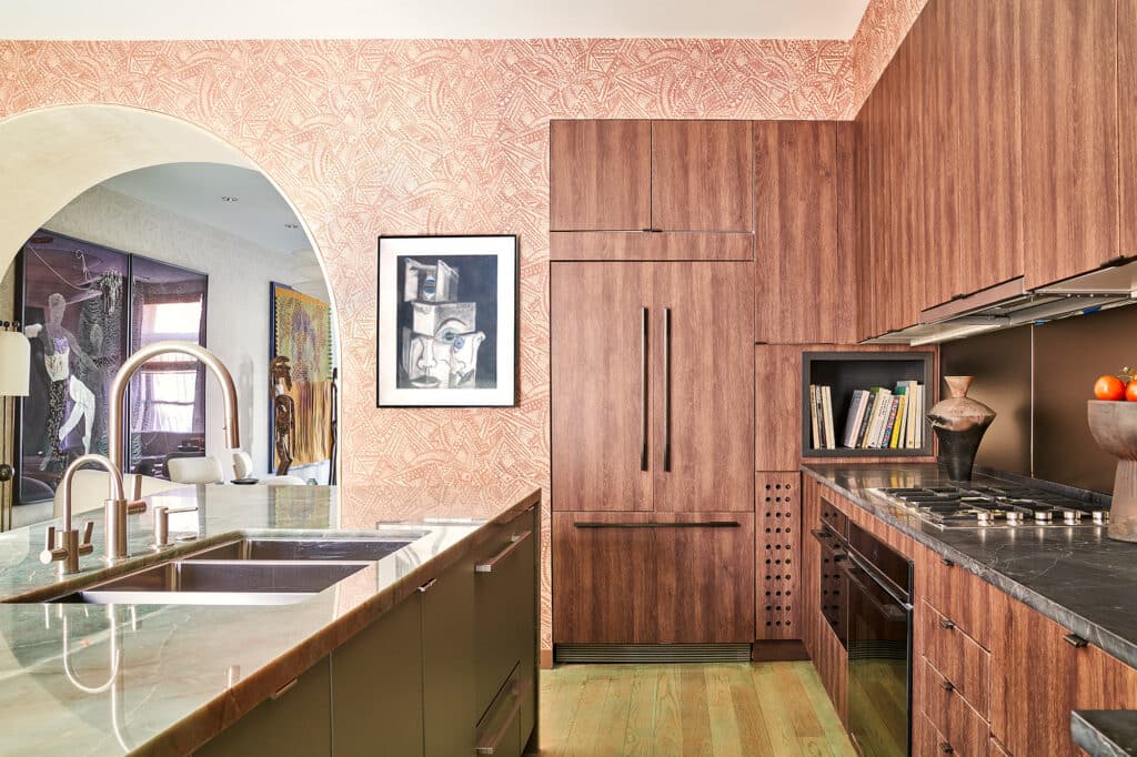
Pop of Peach
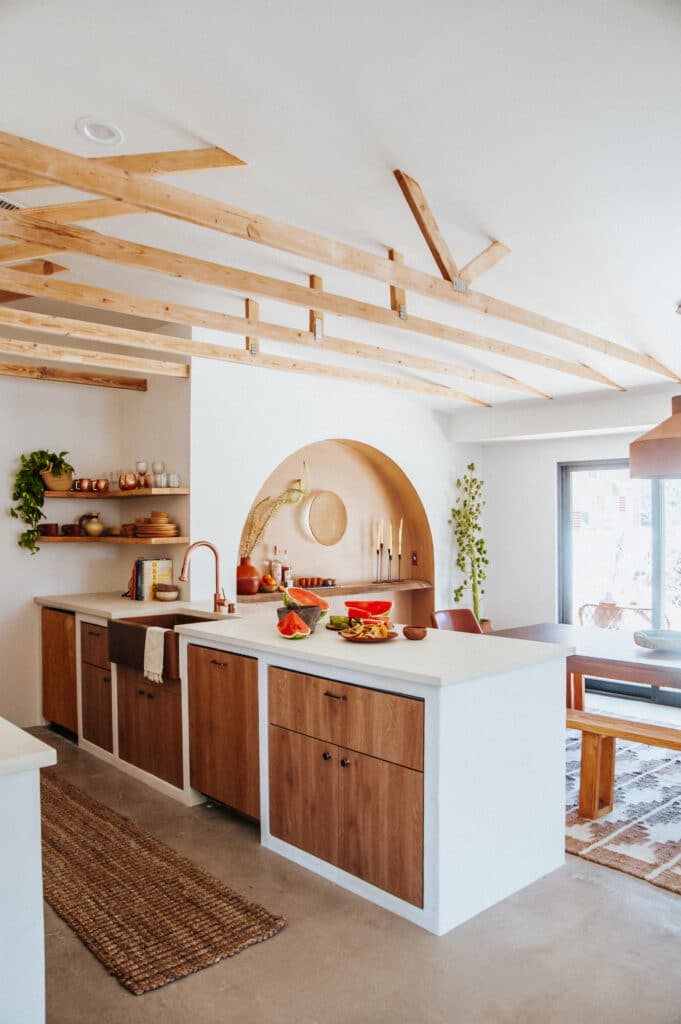
Getting in on a paint color trend doesn’t mean you have to redo all of your cabinets. Take this Oaxacan-inspired space by Claire Thomas for example: an arched alcove painted in a warm clay tone plays up the wood tones in the kitchen’s Semihandmade Tahoe fronts and makes a striking focal point in the dining area.
Design by Sheena Murphy; Photography by Nicole Franzen
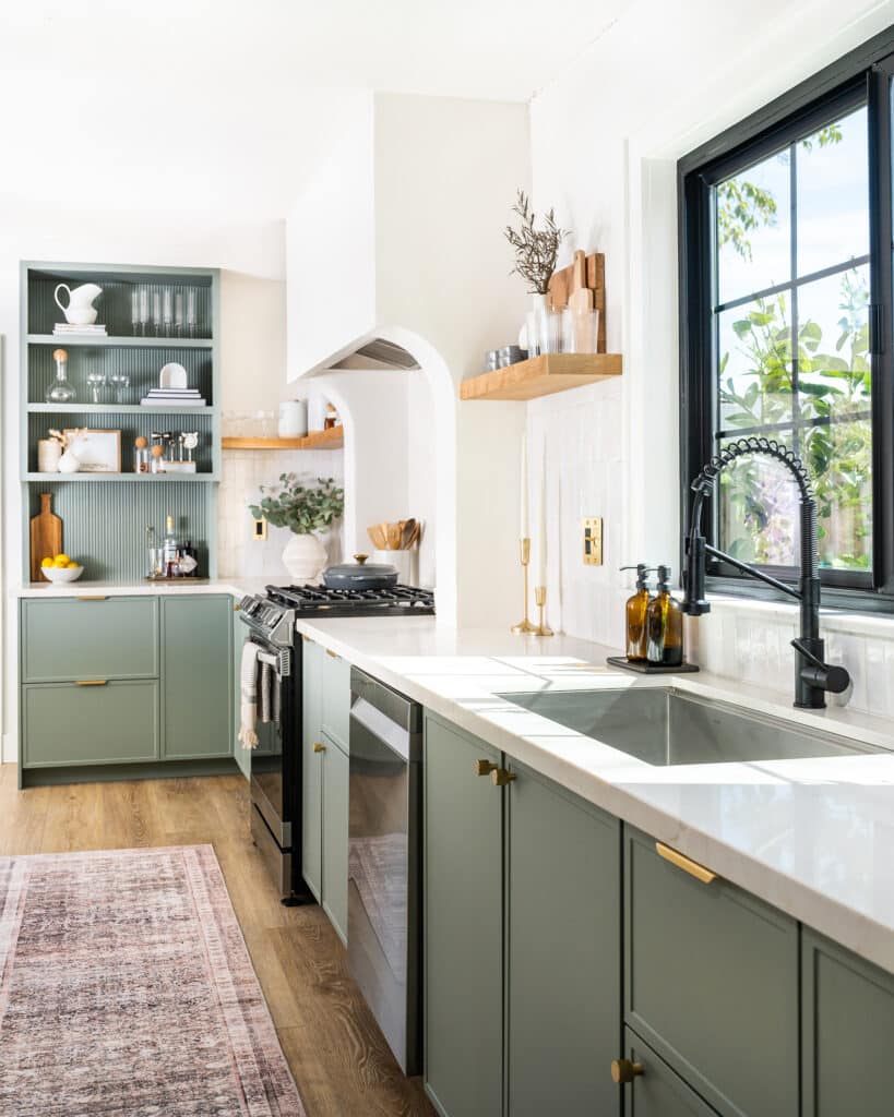
Green Screen
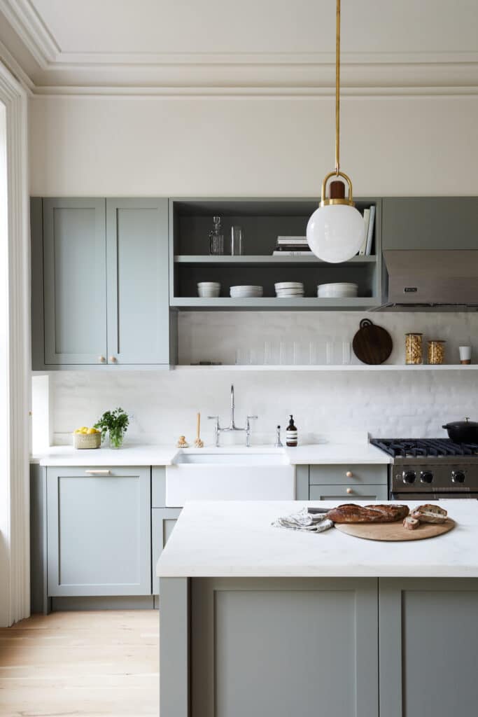
Committing to color doesn’t have to be intimidating, especially when you opt for an ultra-light hue, like the green-grey here in Sheena Murphy’s Brooklyn home. Silver cabinet pulls practically blend into their background for a seamless look, and super-simple white countertops and backsplash allow the cabinets to shine without competition.
Touch of Pink
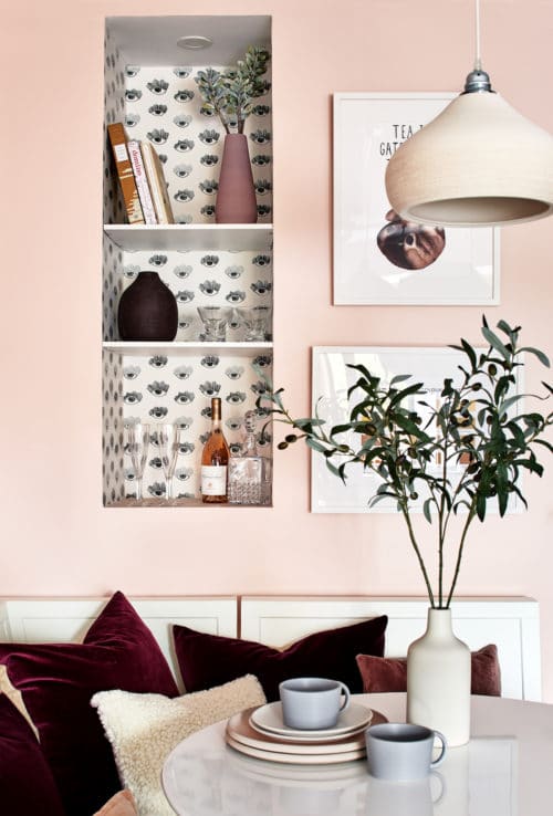
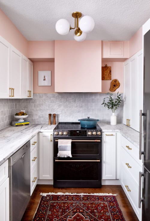
Your wall color can have quite the dramatic effect on your space even if you leave your cabinets alone. In this breakfast nook by designer Zoe Feldman, a pastel pink makes the seating area look lively and welcoming. A wallpapered display nook and dark decorative pillows prevents it from looking overly saccharine. In the kitchen, Benjamin Moore’s Love & Happiness covers the walls above the cabinets and backsplash, drawing the eye upwards.
Design and Photography by Mallory Fletchall
Pretty Pastel
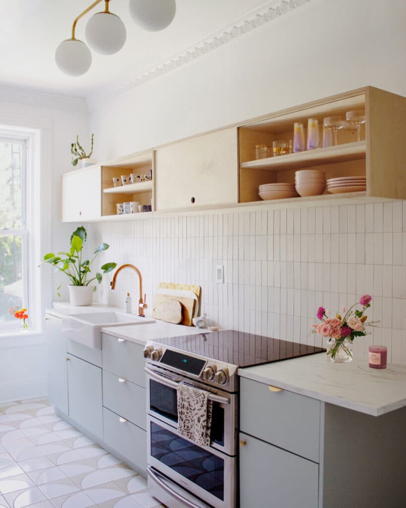
Contrasting cabinets are a great way to try out a more trending hue. Reserve Home’s New York City kitchen includes plywood upper cabinets and Semihandmade Supermatte Slab fronts in Agave. The soft blue color is distinct enough to feel special, but subtle enough to not feel overly trendy. Half-moon pulls on the cabinets lend some extra sweetness (with a nice contrasting pop of brass).


