When Hollyn Baron hired Lexi Brandfon to update her Connecticut fixer-upper, the house was supposed to be a weekend getaway for the LTK retail development lead and her young family. After a complete kitchen overhaul (and a pandemic-induced desire for a lifestyle change), they decided to move in full-time.
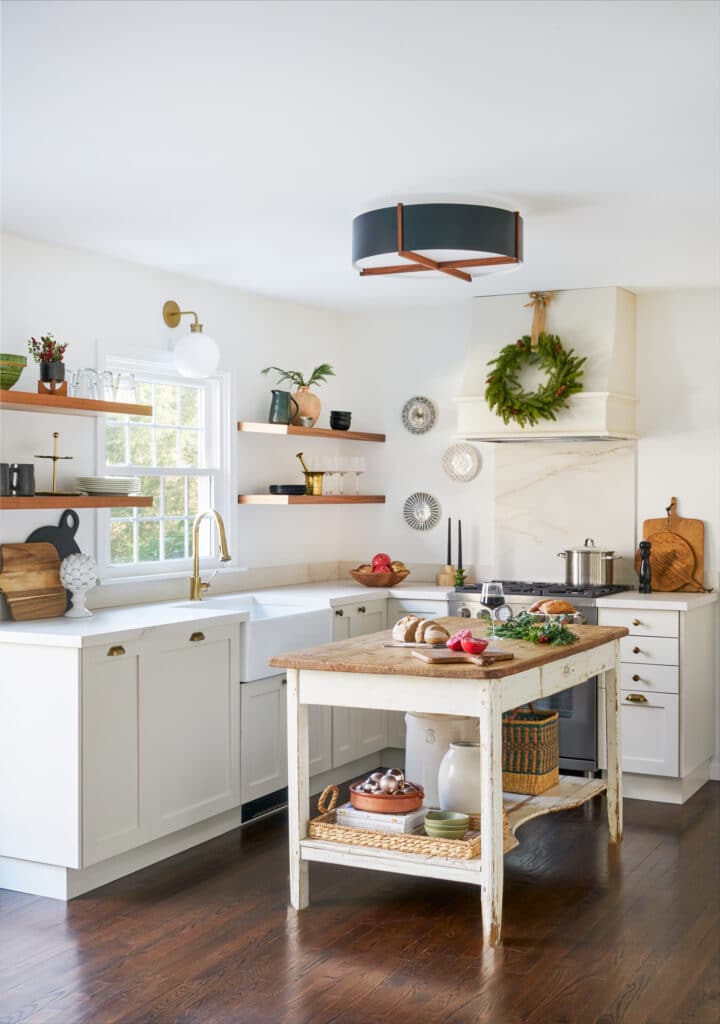
Fortunately, Brandfon, the Brooklyn-based designer behind Lex & Hudson Interiors, created a modern traditional kitchen that’s completely functional for a main residence. She swapped a semi closed-off layout for an open floor plan that fuses the cooking and dining areas, allowing for easy communication and movement throughout the ground level. “They have two young kids, so we wanted to make it more user-friendly,” she explains.
Brandfon also employed super durable finishes that can withstand now-daily use, since Baron originally considered hosting short-term renters in the home. The best part, though, is the contemporary country look that both honors the Litchfield, Connecticut, locale and brings the 1970’s building into the 21st century. Here, Brandfon shares, in her own words, how she achieved the dreamy balanced design.
Try Transitional
“Once the decision to go with IKEA boxes was made, the Semihandmade fronts were the next layer we wanted to get absolutely right because the fronts make the space aesthetically. Shaker is great because it’s a transitional front. It can go modern and it can go classic. The DIY allowed us to get exactly what we wanted,” says the designer.
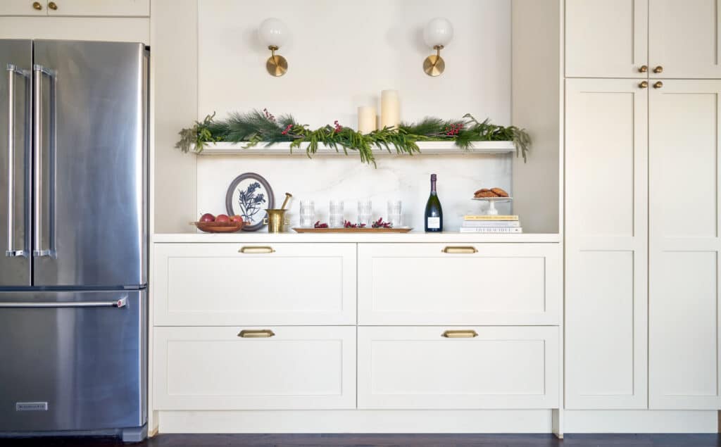
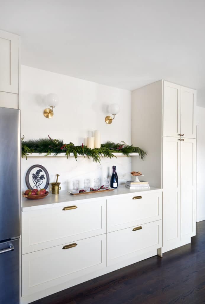
She opted for aged brass bin pulls and knobs, and like all decisions in this kitchen, she was looking to strike a balance between traditional and streamlined. “We didn’t want it to look like grandma’s house. We wanted to have a soulful space that looks like it’s been there for a long time, but able to be used by a modern family,” she adds.
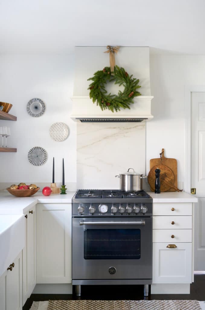
Brandfon calls herself a purist when it comes to mixing metals. “I think there’s a time and a place for it, but I prefer them to match. In my philosophy, if you are to mix metals, it should be a black matte and a brass, chrome, or polished nickel finish. That’s the complement. You can see that here, where we have the brass and we also have the black elements that bring in a little modernity,” she says.
Go Tone-On-Tone
“Hollyn really wanted to keep to a neutral palette and diverge from a white-white to give the room more depth through tonality. We were looking for this perfect, mushroomy, taupe-cream for the cabinets. We did a lot of different paint swatches on the wall to figure out the right color and the right sheen because we had the Semihandmade fronts sprayed. We chose Tapestry Beige by Benjamin Moore,” she says.
The designer also looked to incorporate a veined Dekton countertop. “This material really jived with the cabinet paint color and provided enough of a contrast. It’s also a nice runway to the Chantilly Lace by Benjamin Moore that’s on the walls throughout the house,” she says.
Add Warmth
“The walnut floating shelves are also from Semihandmade. Hollyn wanted open storage for that light, airy feeling. It also feels very modern and the wood on the wall brings a warmth to the space. The area around the window is such a focal point for the room. Functionality-wise, that’s where you want to keep your stuff, right next to the sink. I love playing with lighting because it sets the tone. But we needed a flush mount because the ceilings aren’t so high, so our choices were limited. This Cerno fixture, with the wood accents on it, was really warm and interesting to me. I also wanted something that would spread the light really well and this one ticked all the boxes,” she says.
Incorporate Vintage
“We went back and forth about doing an island in the center of the room. I convinced them that we could always add a permanent one later. This vintage island I found on Chairish really makes the space. It has a front apron, so it seems like it was once a work table. The patina finish, the wood top, and the fact that it had a drawer really worked for us. The airy quality of the shelf bottom made it so it wasn’t too heavy,” says the designer.
“When you bring any vintage piece into a more modern space, you add depth, dimension, and interest. A little bit of history and character helps ground the space and gives it some soul, otherwise you’re dealing with clean, straight lines that sometimes just read a little too stark or serious,” she says.
Prioritize Practicality
“We thought a lot about how much space one needs for a pantry. I suggest an appliance garage for every project. It’s important to get electric and plan carefully for the client’s needs, from a bean grinder to a coffee maker to a microwave. It’s nice that nobody has to look at the appliances. A garbage pull-out is super important in any kitchen, too. There’s also a corner cabinet with carousel shelving, little pocket drawers within some of the drawers for different levels of storage, and rolling trays that allow you to really get to the back of a deep cabinet,” she concludes.
QUICK Qs WITH HOMEOWNER HOLLYN BARON
Favorite element?
Being able to customize the cabinetry color. Lexi and I poured over so many color options and having that flexibility made it feel super custom. Everyone comments on how great the color is!
Most unexpected renovation lesson?
Take some risks — anything that felt a bit “out of the lines” has been a favorite element after everything is complete. This includes color, appliance choices, stark black lighting, and a huge vintage piece that serves as our island.
What you’d never do again?
Lexi and I discussed the finish on the knobs and bin pulls, as well as doing a mix. I jumped the gun and ordered them myself, counting the knobs and pulls wrong and they weren’t returnable. We literally just left them outside for someone to take. We blew about $155 and wouldn’t have if I would have double-checked and really thought about what kind of knob would go where.
Why Semihandmade?
We saved about $10,000 on our kitchen cabinets by not getting our general contractor to have them made completely custom. We were renovating so many different elements and were on a budget. That extra $10,000 went to being able to fix the entire finished basement and that space is now just perfect.
Favorite memory in the new kitchen?
Honestly seeing it decorated by Lex & Hudson for this shoot was SO fun. I hung around while the space was being decorated and I kept hearing Mariah Carey Christmas songs in my head and thinking about all the Christmas cookies I’ll make with my kids this year! The mess is always worth it.
More Stories...
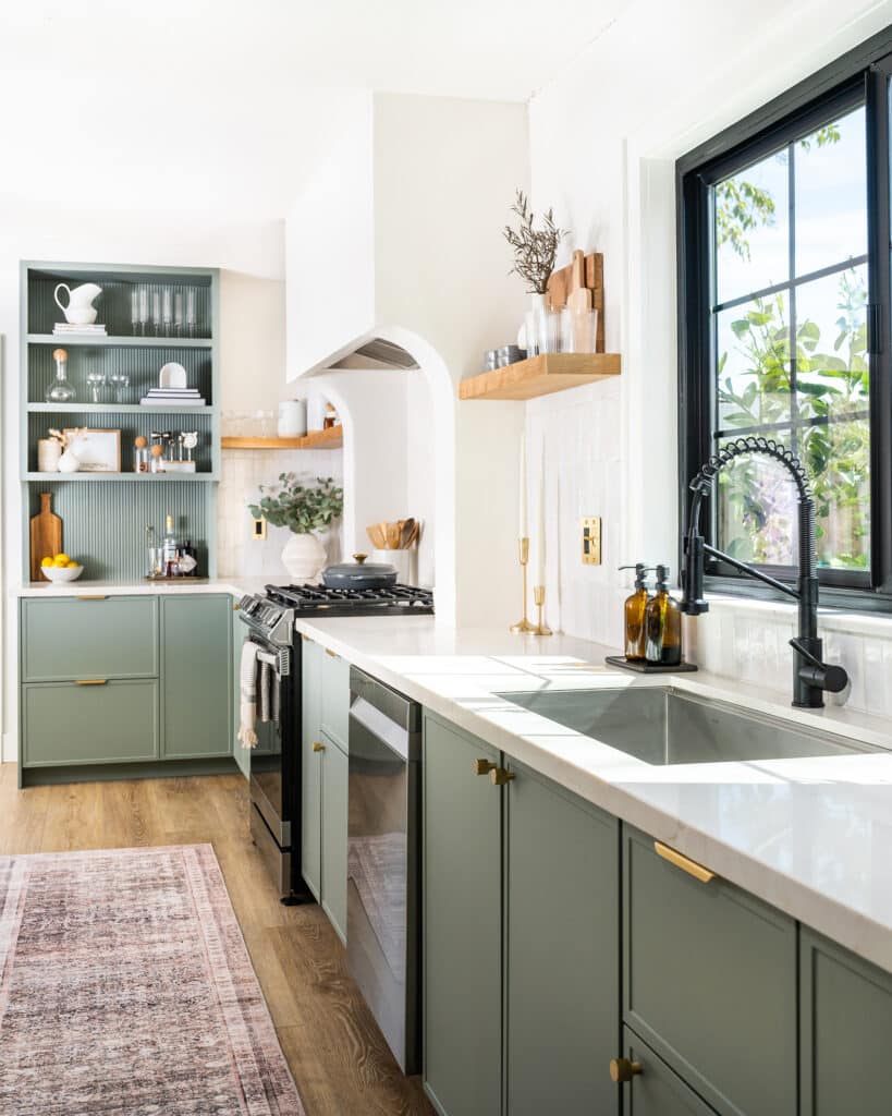
The space is decked out in Semihandmade Moss Quarterline and Tahoe.
House flippers and mom-daughter duo Lacey and Audrey Soslow created the kitchen of their (buyers’) dreams.
Malene Barnett teamed up with designer Leyden Lewis to create a space representative of her work.