Upon stepping into this 1885 home, designer Ashley Beaumier couldn’t help but notice that much of the interior had already been demoed. Undeterred, she and her team, which included Kassidy Benson of Living Room Denver and Josh Schaffer of Rog & Wilco Construction, set out to return some of the Victorian charm to the place.
“We’d run into this exact thing on our first project together, where a green flipper had purchased the home and started demolishing before they realized they were in over their heads,” Beaumier says.
Less is More
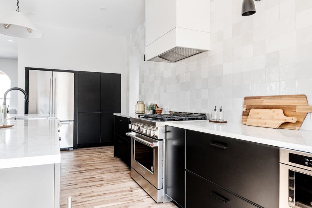
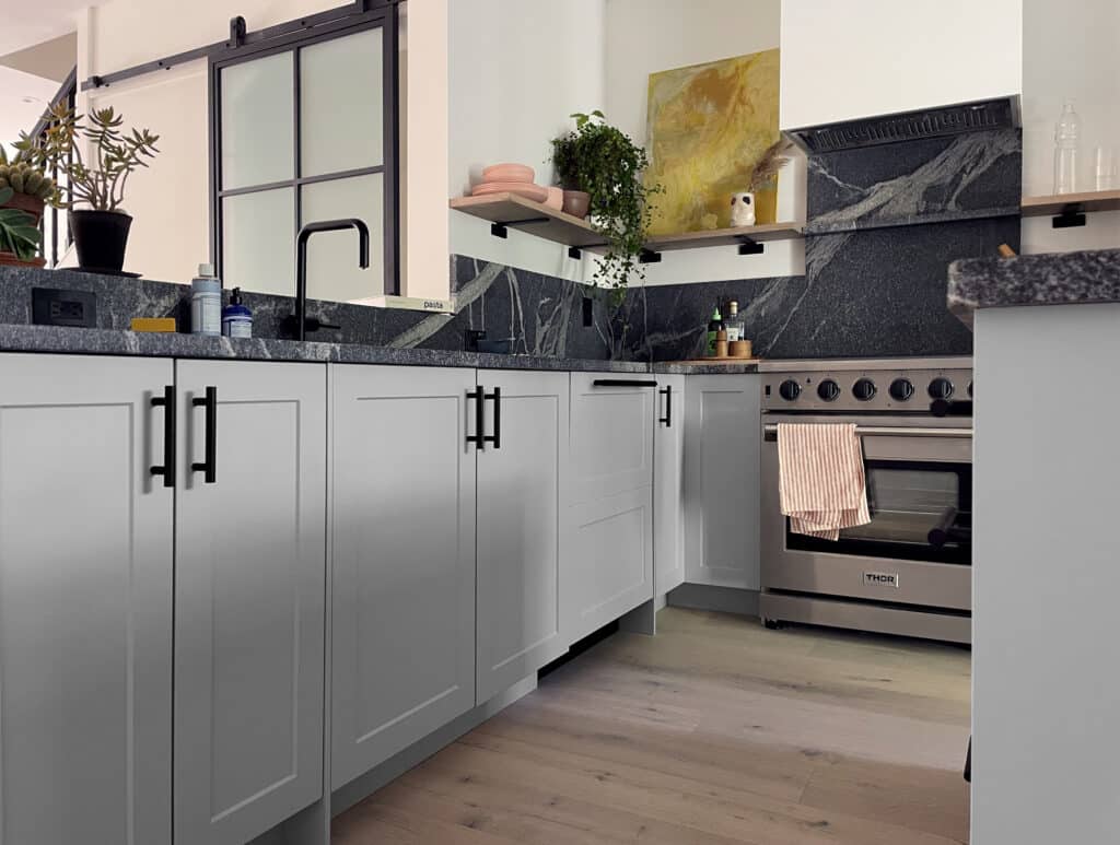
Despite its potential, the sheer amount of cabinetry in the “Frankensteined” kitchen needed to be addressed. “With almost 27 linear feet of cabinetry between the range wall and island, as well as pantry storage next to the fridge, it was an easy decision to omit upper cabinets and showcase a full wall of,” says the designer.
With a more open space, the team needed to address how to update the rest of the cabinetry. “We’d used Semihandmade on a few other projects I’d designed for Rog & Wilco, so knowing their end goal and budget, it was top of mind,” she adds. After exploring various options, the team decided to go with BOXI. “We jumped on the opportunity to work with BOXI based on the shorter lead time and fully-assembled components,” she explains.
Black, White, and Airy
The exterior was painted in , and in order to bring the façade and interiors together, Beaumier used BOXI’s Peppercorn Edge cabinets in the kitchen “I knew I wanted a black kitchen for this space. I loved the modernized Shaker look the Peppercorn Edge profile offered, and that it provides just enough detail to soften the black,” she says.
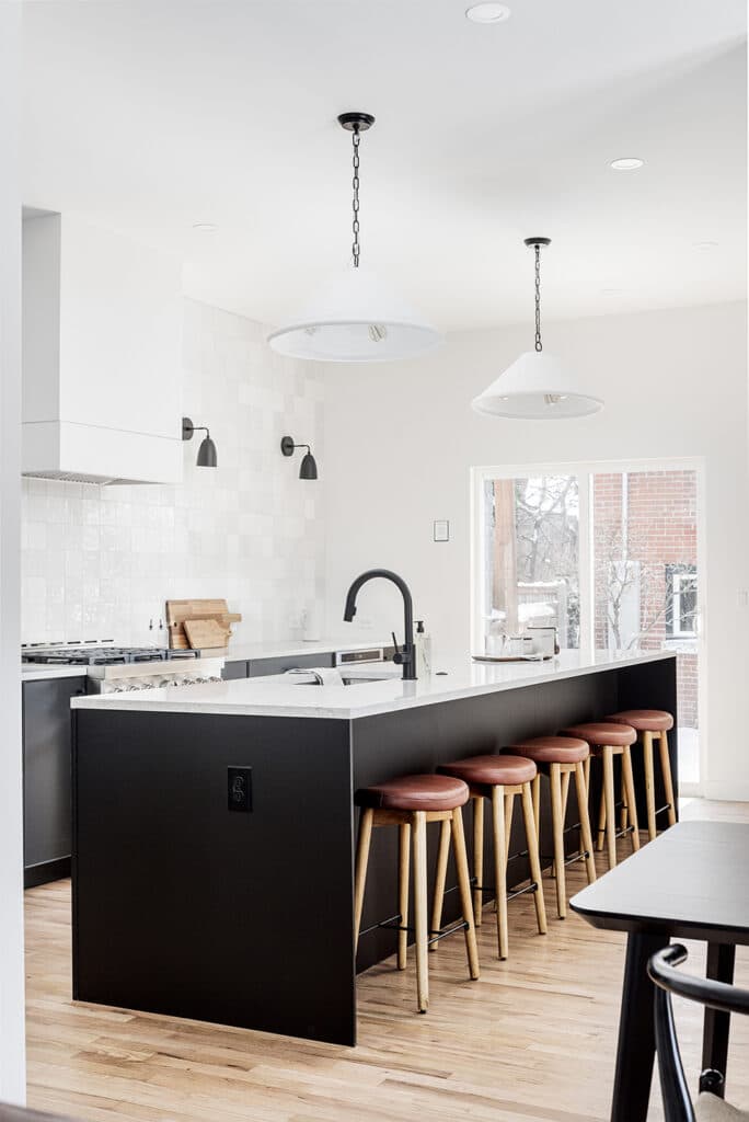
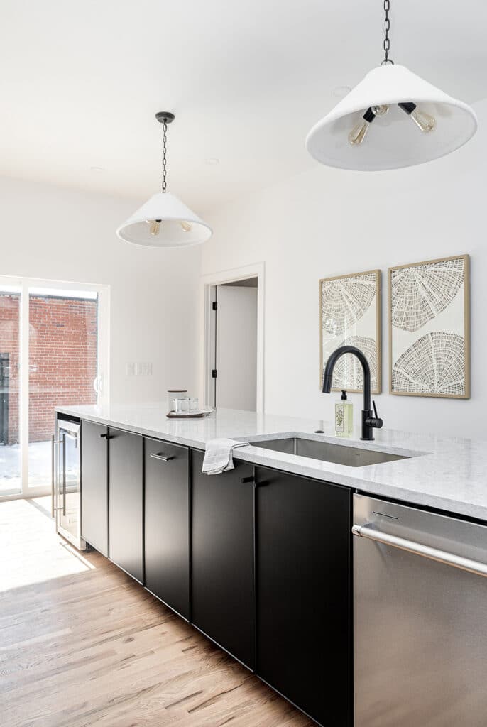
The kitchen, which was already narrow, needed to be offset with bright details in order to keep it feeling airy such as the white hood, impressive tile wall, MSI Galant Gray 3CM Quartz countertops, and Billie concrete pendants from Regina Andrew.
Seating For All
Another challenge was that there was not enough room for a formal dining area. Designing with a young family or couple in mind, Beaumier improvised by maxing out the length of the kitchen island, giving future homeowners a place to eat lunch or help with homework. By reconfiguring the layout, the team was able to prioritize what mattered.
Bringing it Together
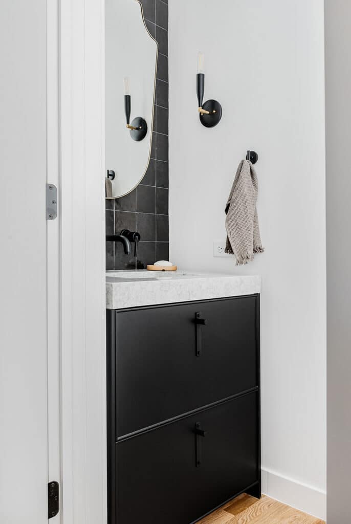
After building the color palette in the kitchen, they repeated the Peppercorn Edge in the powder room. “We paired it with the same ceramic tile as the kitchen, but in black for a moodier feel and then used black as an accent in the remaining spaces through lighting, mirrors, and hardware,” Beaumier explains.
Muted and Simple
In the second bathroom, BOXI’s Mushroom Slab cabinets were used. “They are minimal and the perfect shade of gray to maintain that light and airy feel,” she says.
The final result is a home that retains its original 1885 charm yet is fully modernized.
*If you purchase something using one of the links in this article, we may earn a commission (at no cost to you). Rest assured we only recommend products we’ve vetted and loved.
More Stories...
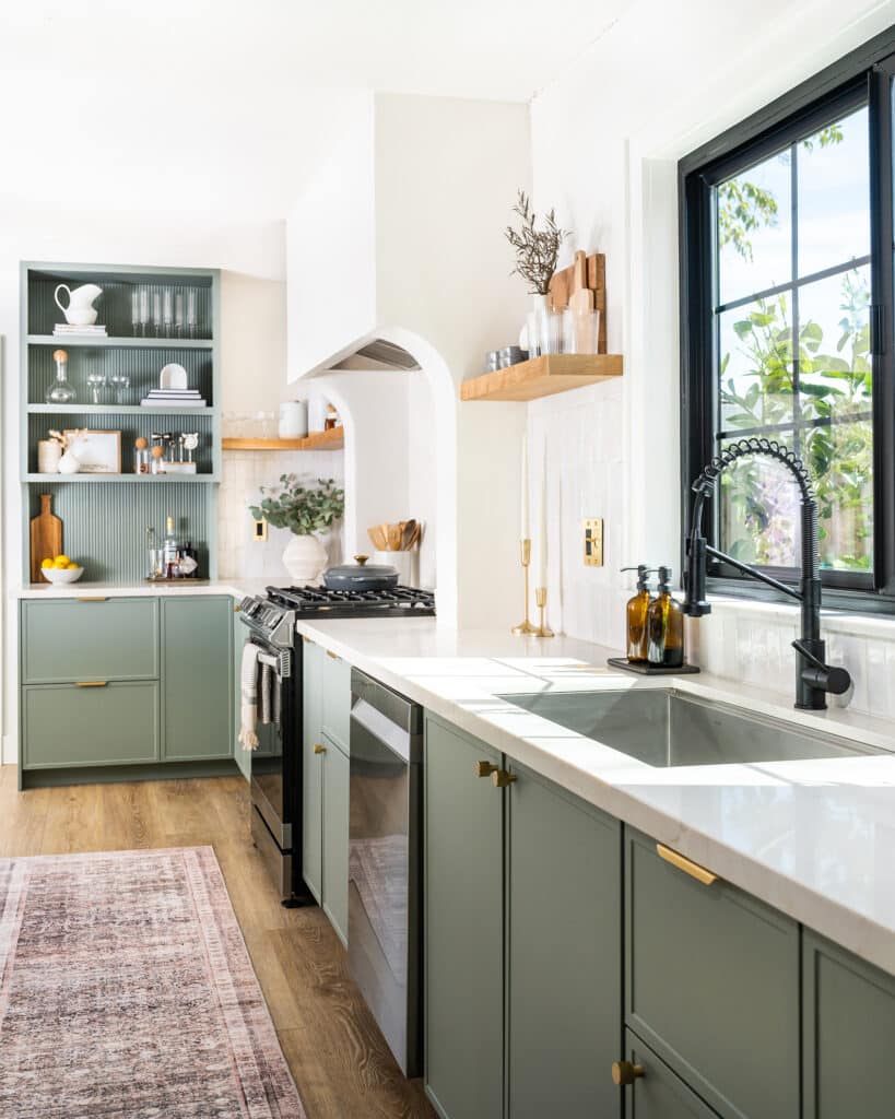
The space is decked out in Semihandmade Moss Quarterline and Tahoe.
House flippers and mom-daughter duo Lacey and Audrey Soslow created the kitchen of their (buyers’) dreams.
Malene Barnett teamed up with designer Leyden Lewis to create a space representative of her work.