Picking a white paint for your kitchen cabinets is like trying to find the perfect plain white T-shirt. It seems like such a simple task—but it’s endlessly complicated. When you’re looking for something so simple amid a seemingly infinite number of possibilities, the frustration comes fast. But the end result is worth the search.
White kitchen cabinets are a popular choice for a reason. They’re complementary to just about every design preference, they help to brighten up spaces of all sizes, and they’re trend-proof, so they’ll look great for years to come. Not to mention, they match well with just about any countertop and backsplash that you can think of.
The only hard part about designing a kitchen with cream and white cabinets is landing on the right white (or cream, or off-white). But luckily, there are experts that have done the hard work of combing through piles of paint chips and swatching colors—and they’ve landed on some real winners. These are the best white paints for kitchen cabinets, according to five designers.
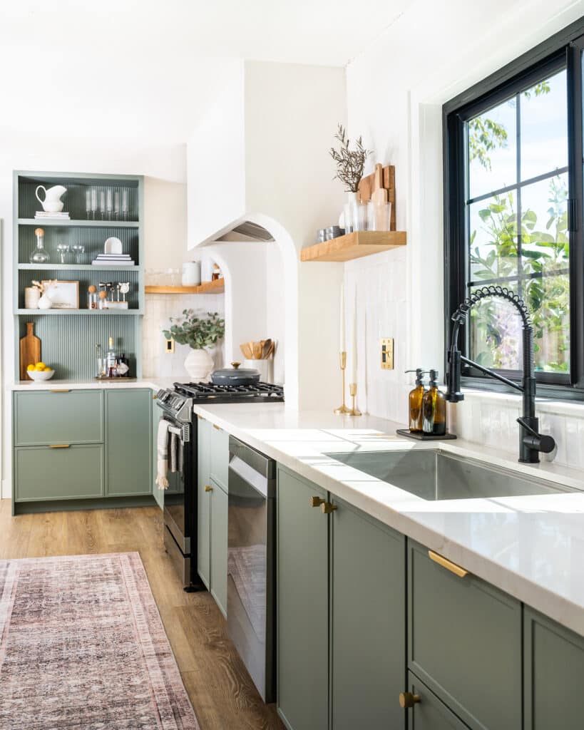
Farrow & Ball Cromarty
Angela Tafoya, editorial director of Lonny, has frequently turned to Farrow & Ball for its richly hued paints, but she used for the first time in her kitchen on Semihandmade DIY Shaker fronts. “I wanted to create a space that felt vibrant and open,” she says, and this paint’s muted green-gray finish was the perfect match—especially because it complemented her Fireclay Tile floor. “I love how the tiles have a lot of playfulness and the cabinetry feels airy and classic, while still offering a unique design,” she adds.
Design by Angela Tafoya; Photography by Erin Kunkel
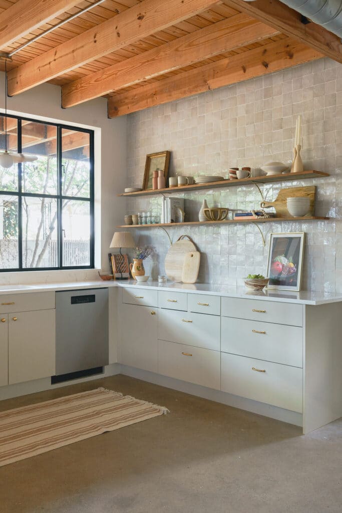
Farrow & Ball Drop Cloth
Boston-based interior designer Christina Wikman of Chestnut Grove Designs was looking for a warm white when she landed on , which she says strikes the perfect balance between warm and cool. For this space, she wanted to evoke the simple, utilitarian style of a British kitchen. “British designers often use muted and earthy colors on their cabinetry, which served as inspiration for this color choice which leans towards a taupey mushroom tone,” she says. “I wanted the kitchen to feel bright, but not sterile, as some white kitchens can look.” A bonus: the color made a perfect addition to the wood tones and brass accents in the space.
Design by Christina Wikman; Photography by Jessica Delaney
Creamy White by Benjamin Moore
When considering the ideal paint color for this kitchen, California designer Jessica Jones didn’t want to land on a stark white. To make the space feel “warm and inviting,” she used three coats of , which she was drawn to for its taupe undertones. “We wanted a timeless kitchen with a touch of European modern,” she says. A mix of Semihandmade DIY Shaker and Slab fronts add to the space’s old-meets-new appeal.
Design by Jessica Jones; Photography by Nicole Dianne Photography
Flatiron by Clare Paint
Phoenix-based blogger Angela Treat had never used Clare before she picked up Flatiron for her kitchen cabinets—and she was duly impressed by how it made her space look. She opted to buy the brand’s trim paint, which dries to a semigloss finish and has a durable wear that’s great for kitchen cabinets. After spraying two coats of the paint onto her Semihandmade DIY quarterline cabinet fronts, she found that the hue was the perfect choice for her space. “The taupe-greige color of Flatiron tied in well with the veining in the quartz countertop in my kitchen,” she says. “While also balancing out the butcher block countertop in the nearby mudroom.”
Design and Photography by Angela Treat
Benjamin Moore Revere Pewter
This “chameleon greige” color is a favorite of Los Angeles-based Natalie Myers of Veneer Designs. This is the third space in which she’s used , and she loves it for its versatility: “It can read tan or greenish or off-white depending on the light. It keeps us all guessing but whatever direction it takes, it always coordinates with the other finishes.” This unique quality made it the ideal pick to soften the more masculine, industrial elements of this kitchen—in addition to details like unlacquered brass hardware and perfectly imperfect zellige tile.
Design by Natalie Myers; Photography by Charlotte Lea Photography
More Stories...
The space is decked out in Semihandmade Moss Quarterline and Tahoe.
House flippers and mom-daughter duo Lacey and Audrey Soslow created the kitchen of their (buyers’) dreams.
Malene Barnett teamed up with designer Leyden Lewis to create a space representative of her work.
Comments (3)
Wish someone would figure out a paint color that takes into account electrical plate colors. There are often a lot of these in the kitchen, and sometimes “white” just doesn’t look good.
I lean towards Leviton ivory as a wall color-but I ain’t no fancy “designer” 🙂
Beautiful! What material are the doors made from?
Can you tell me what color was used in the ‘cover’ photo (design by Samantha Gluck)?