When you’re designing a kitchen, few decisions feel quite as pivotal as picking your cabinet color.
While your flooring, backsplash, countertops, and even your hardware all play an important role in pulling the room together, your cupboards are inevitably the star of the show—and deciding on the right color can leave you feeling stuck.
After all, when you opt for paint-ready cabinet and drawer doors, the possibilities are quite literally endless. Will you think outside of the box with an on-trend green hue, go classic with classic and serene white, or choose something else entirely?
So, we turned to the pros to see what popular kitchen cabinet colors they’re loving right now—and their answers, from calm neutrals to invigorating jewel tones, make picking up a gallon of paint feel especially tempting. Chances are, they’ll have just the right suggestion to revitalize your space.
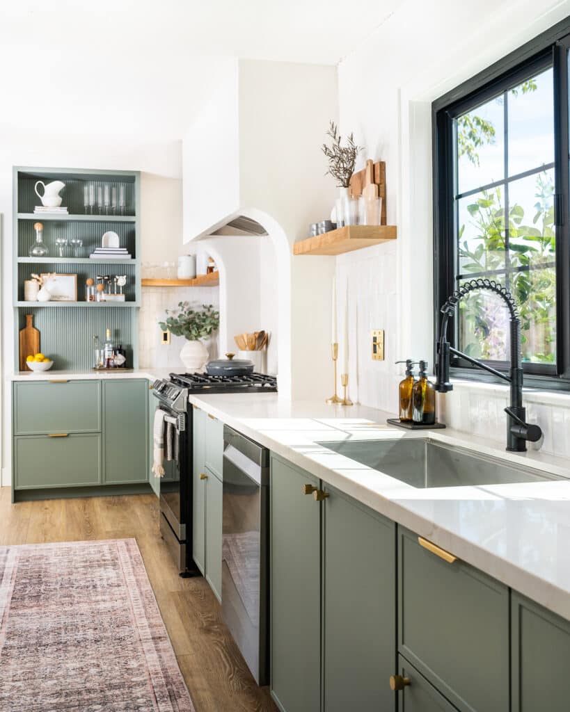
The Subtle Blue
If you’re hesitant about dipping your toes into the world of color, then consider : this light, almost-neutral paint color may be your perfect match. “I like how this weathered cool blue-gray can subtly shift between the two hues depending on the time of day because of its blue, green, and black pigmented undertones,” explains designer Keita Turner.
While it might feel natural to pair a cooler tone with silver or pewter hardware, she notes that this “timeless” hue works just as well with warm, rich tones, which can be incorporated in your countertop, tile, and metal finishes.

Farrow & Ball,
The Perfect White
Every designer has their favorite go-to white paint, and for Ruqiya Imtiaz, that’s none other than Benjamin Moore’s . “It instantly adds warmth and feels welcoming in any naturally lit kitchen,” she says.
And just because you go with white cabinets doesn’t mean your entire kitchen has to follow a neutral color scheme. Imtiaz loves pairing this paint color with contrasting countertops and textured or patterned backsplashes for a more dramatic statement.

Benjamin Moore,
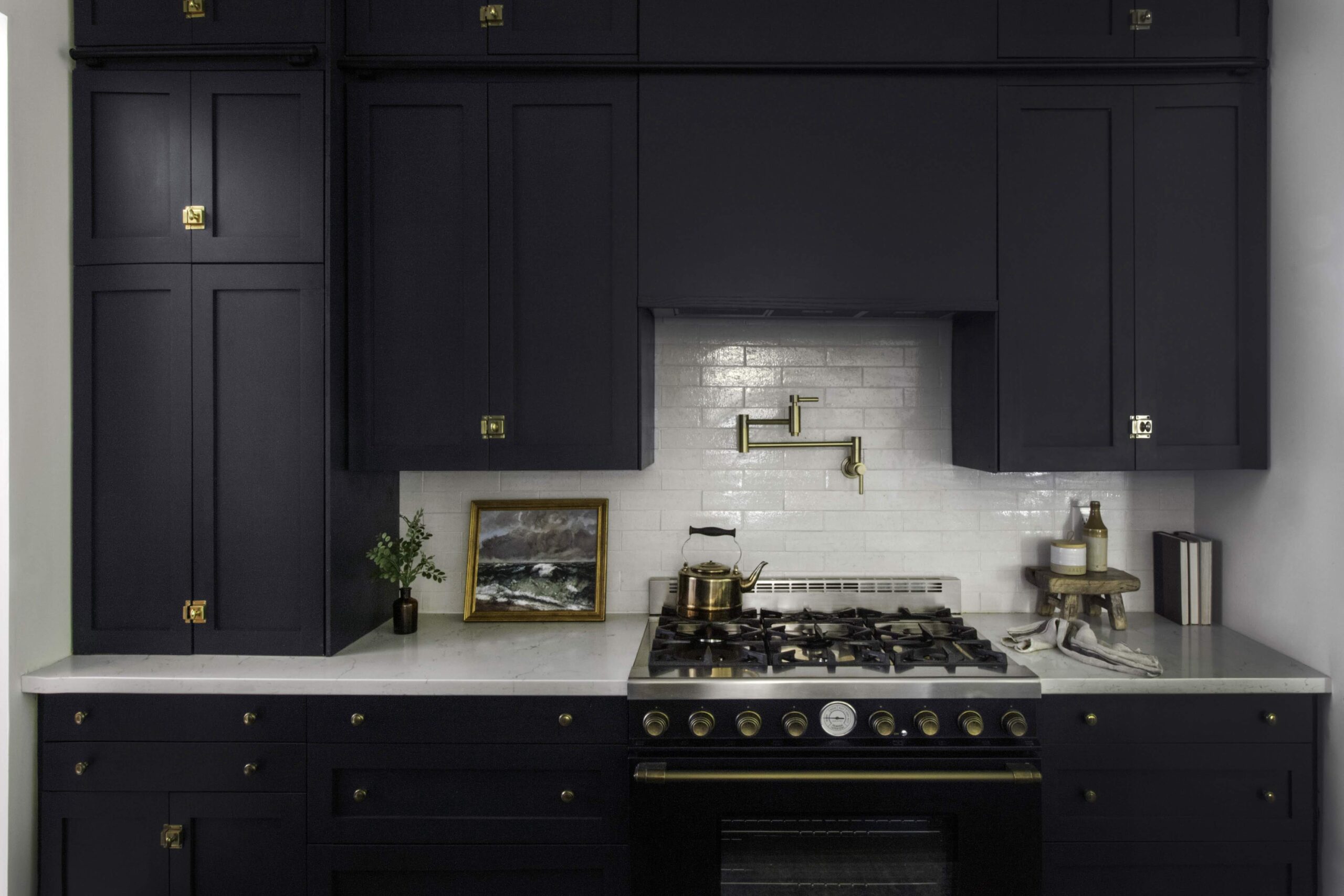
The Barely Navy
Black or navy cabinets are striking if you want to create some contrast in your space, but Catherine and Bryan Williamson of Beginning in the Middle have another favorite that offers just a little more depth: Behr’s . The couple even used the paint in their own kitchen.
The hue is surprisingly versatile. “It’s a chameleon color that changes from blue to green to gray to black over the course of the day,” Catherine explains. “It’s bold and makes a statement without feeling bright or trendy.”

Behr,
The Wild Card
When she’s thinking classic, designer Eneia White loves the look of a light gray kitchen (Sherwin-Williams’s is her go-to). But sometimes, she likes to think outside of the box. One such pick? Sherwin-Williams’s rich Fuschia tone, .
“Dynamic and saturated, I love the energy this color brings into kitchens designed around entertaining,” she says. All you need is a good home bar, and you’ll be pretty much set with the best setting for a cozy cocktail hour, whenever you want.

Sherwin-Williams,
The Inky Black
Although designer Mikel Welch enjoys the clean, bright look of a white kitchen, when he wants to try something different, he goes bold with Abysse—a lush, jewel-toned blue-green.
“There is nothing like a rich darker tone cabinet to give a space a regal and sophisticated feel,” he says. “This color it’s not for the faint of heart—it takes a confident kitchen to pull off Abysse!” So, if you bring this hue into your own home, don’t hold back: floor-to-ceiling blue cabinets can look especially striking.

Ressource Paint,
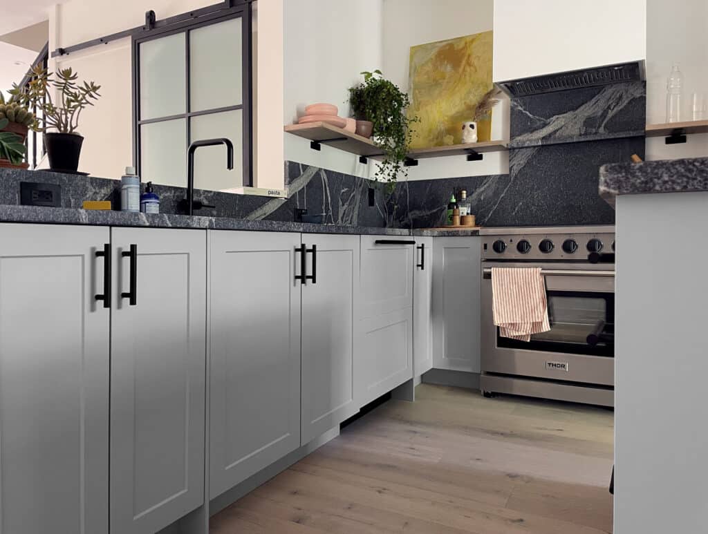
The Calming Gray
A good gray paint is just as classic as white or walnut when it comes to kitchen cabinets, and designer Anissa Zajac of House Seven Design calls out Sherwin-Williams’s as her own personal go-to.
“Because it’s so neutral, this color is versatile and complements most finishes and accent colors,” she says. Whether you’re going for a striking backsplash made with cement tiles or opting for timeless subway tiles, you can hardly go wrong with a hue that’s quite so, well, agreeable.

Sherwin-Williams,
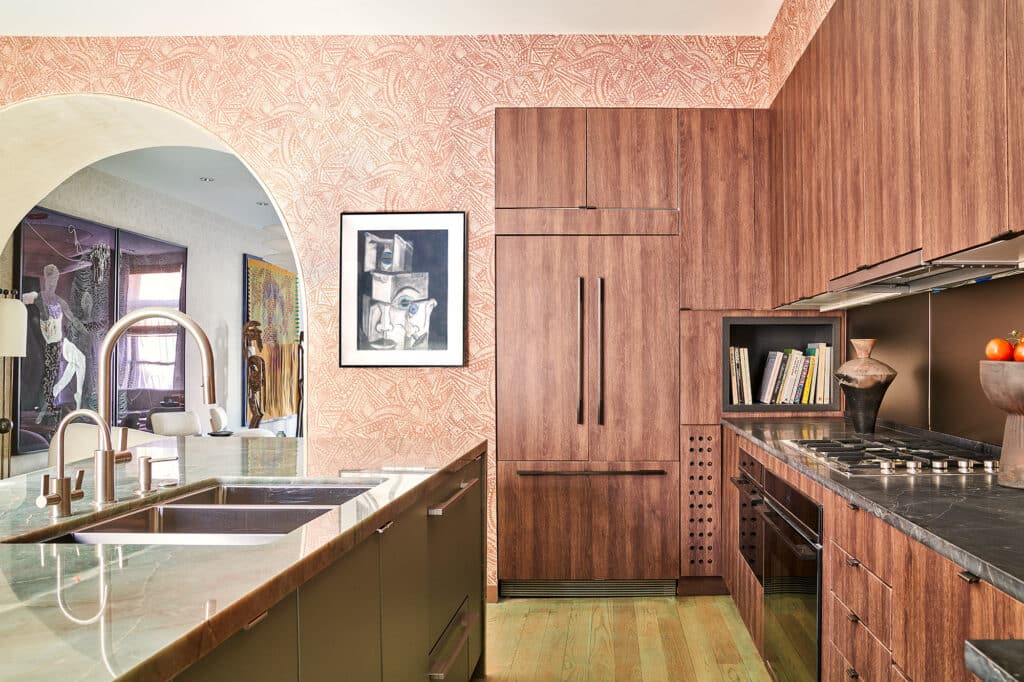
The Striking Oxblood
If you’re interested in the idea of darker cabinets, but not quite sold on the green trend, then consider the opposite side of the color wheel. “We just updated a tired oak island with Benjamin Moore’s , a rich blood red,” says Britt Zunino of Studio DB.
The warm tone pairs especially well with warm woods (think: butcher block countertops), but can also look especially striking—even fashionable—with marble or glossy tiles. “It feels unexpected and a little edgy, which is incredibly chic,” Zunino adds. “Plus, the saturated color reminds me of my favorite Chanel nail polish.”

Benjamin Moore,
The Breezy Blue
“Upper and lower cabinets don’t need to match,” says Clare Paint founder Nicole Gibbons. For a lighter feeling, she recommends white or neutral upper cabinets and a bolder choice like on the bottom. “Another of my favorite shades of blue for kitchens is a breezy blue-green hue called . It looks amazing on an island paired with marble countertops and is a great way to add color without overwhelming the space and it also pairs perfectly with warm whites.”

Clare,
*If you purchase something using one of the links in this article, we may earn a commission (at no cost to you). Rest assured we only recommend products we’ve vetted and loved.


Comments (1)
The use of darker colors and tones really interests me as a homeowner. I’ve been trying to redesign my kitchen in as many ways as possible, so I can see the benefit of going for bolder colors to make it really feel new. I’ll work with a remodeling contractor for sure so they can assist me with customizing kitchen cabinets like this.