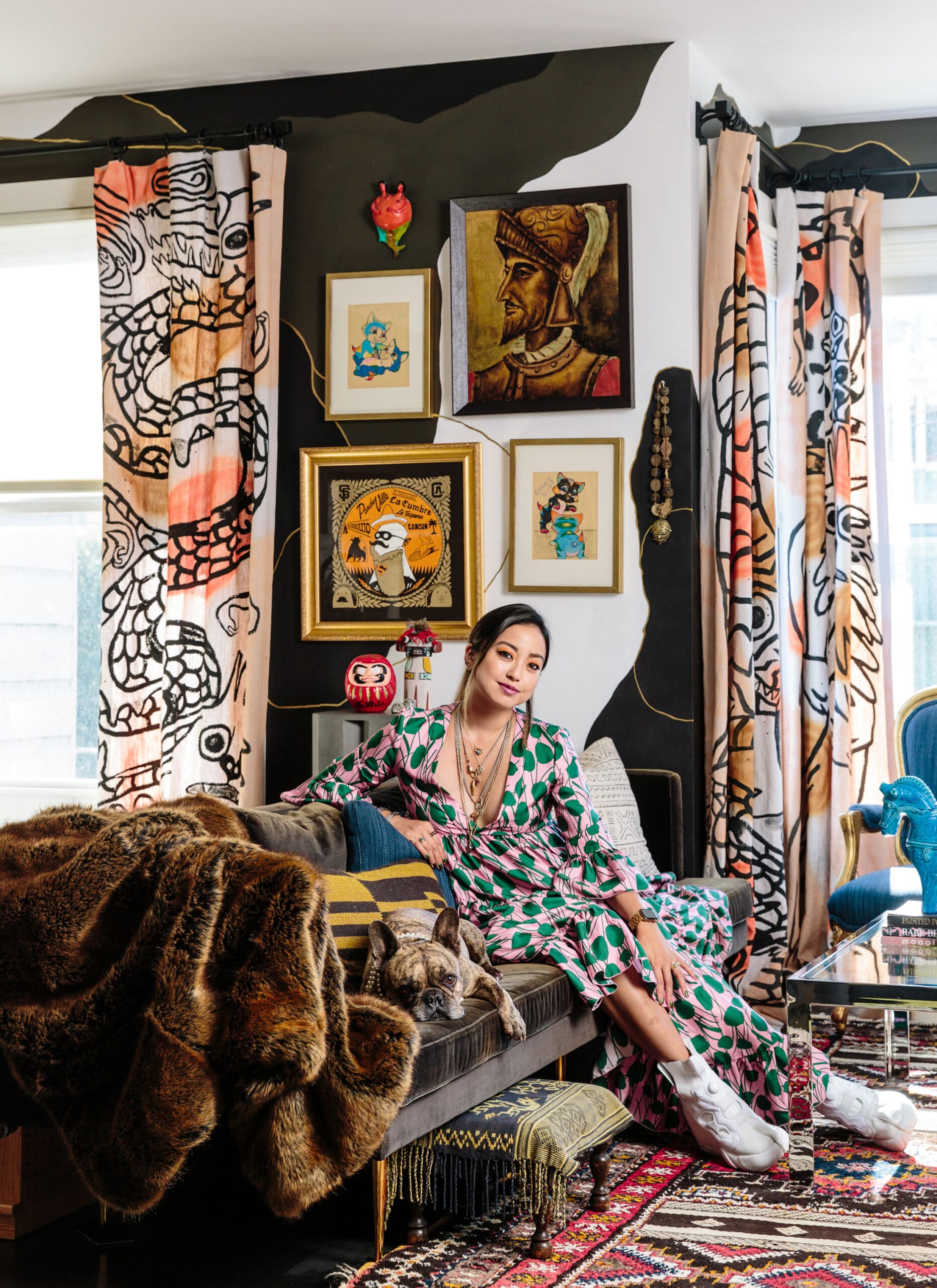
In this month’s installment of Do as a Designer Does, we pick the brain of San Francisco-based designer Noz Nozawa. Her style is decidedly bold and unabashedly maximalist, which is why she’s sharing her philosophies on designing with prints and patterns.
Noz!
How do you mix prints and patterns so brilliantly? Please share your secrets!
Thank you!
Sam
Hi Sam!
First and foremost, I think the key here is to select the right patterns. If you look closely, a lot of the patterns I use don’t have a very tight, consistent repeat, and they’re larger in scale. For example, a lot of the rugs I use have more of a mural look. The same is true for my curtains — they were hand-painted by a friend and are actually more graphic than patterned. And my yellow and black striped chair — the stripes change in width and length throughout the print.
These loose, large-scale prints are a great starting point, especially if you’re a bit nervous about dipping your toe into the world of pattern. They give you a little more room to play in terms of mixing and matching, and they don’t make as strong of a visual statement as a tight, high-repeat pattern (like a plaid couch, for example).
Secondly, I think it’s helpful to select the largest surface that you’re willing to add pattern to, and go from there. The walls or ceiling would be the biggest, followed by a couch, rug, or bedspread, depending on the room. That gives you a starting point for pattern and color, and you can anchor the design around that statement print. From there, anything goes — you can carry a specific color from that larger pattern into the rest of your space, or add a second pattern that’s maybe a bit more subtle, like stripes. You can even add in small touches of secondary pattern via accessories, like a lampshade or throw pillow — it’s all about what you’re comfortable with.
I also think that keeping the color story tight allows you to play with a lot of pattern without it feeling visually overwhelming. For example, I designed a bedroom that has a ton of pattern and texture, but everything is blue, grey, or white for the most part. The space is still print-heavy, but it easily registers as a blue and white room.
As far as grounding a space goes, I love using wood furniture and black accents. I think black can really anchor a room, and wood adds a natural element, which balances out a super bold space. It can be a tree stump side table or even hardwood floors surrounding a rug, but I think wood is incredibly important. Time is also very helpful when deciding on a design. Our brains are evolutionarily wired to resist change, so you may not like your new space when adding new color and pattern all at once. It’s important to sit with a design and see how you feel over time, especially if you’ve really gone outside of your comfort zone.
My last bit of advice would be to always order physical samples — they’re so important when working with loud colors and patterns! Get paint swatches, fabric samples; everything you can to help you truly envision the design before you dive in.
Hope this helps!
More Stories...
The space is decked out in Semihandmade Moss Quarterline and Tahoe.
House flippers and mom-daughter duo Lacey and Audrey Soslow created the kitchen of their (buyers’) dreams.
Malene Barnett teamed up with designer Leyden Lewis to create a space representative of her work.