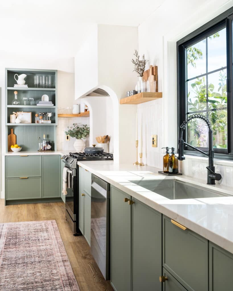
Lindsay Marcus’ kitchen renovation was 10 years in the making. While it was always high on the Los Angeles-based designer’s list of updates for her 1927 Glasgow Park home, a new build next door proved to be the final tipping point. “I knew the new home was going to completely close off our space,” she tells Semihandmade. “I needed to open up the view in the opposite direction via the kitchen, so it wouldn’t feel so dark.”
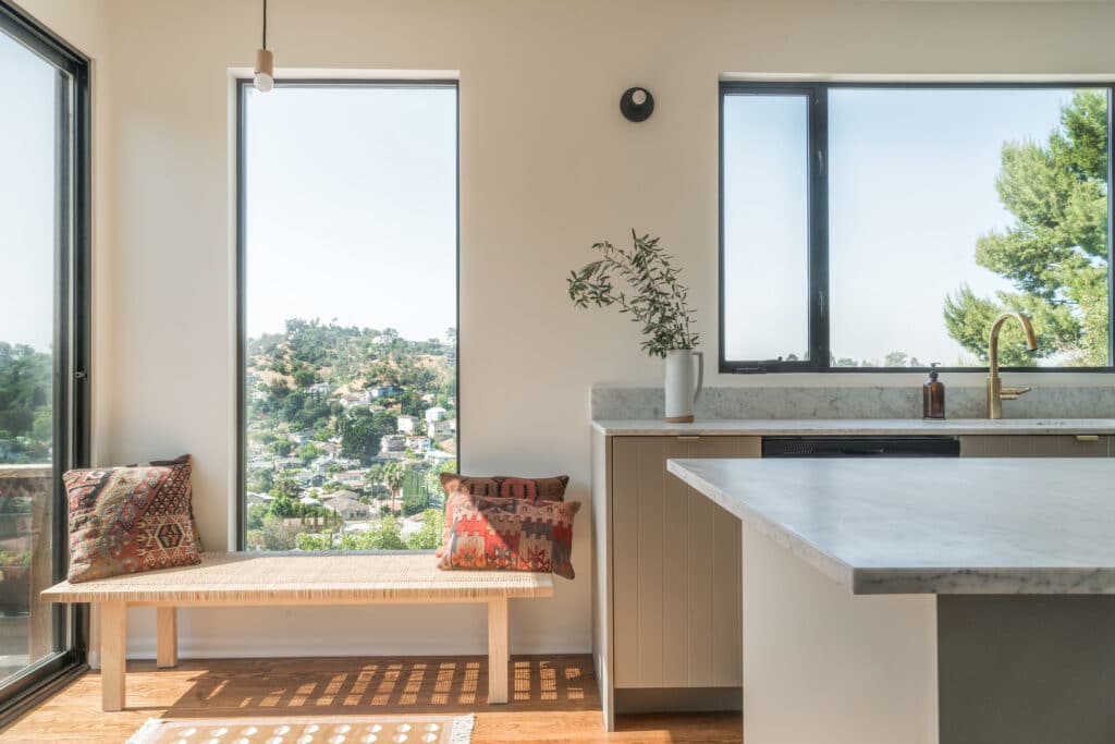
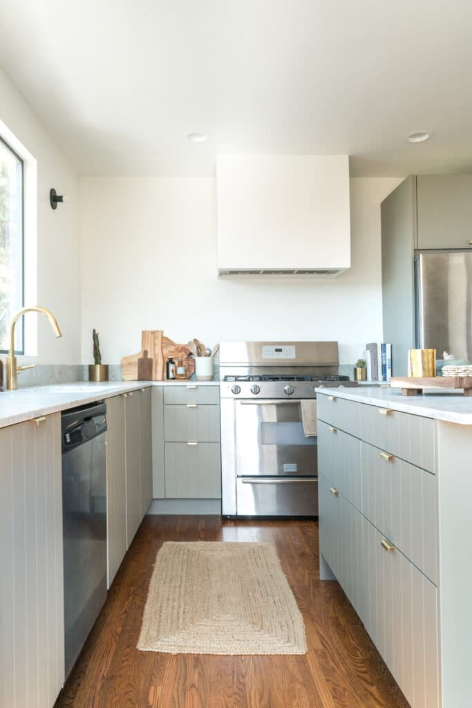
To bring her vision to life, Marcus’ plan called for a widened entryway, wall removal, and enlarged picture windows overlooking the rolling California hills. “The windows were my first priority, especially the sink window,” she shares. “I wanted to make sure you could see the view from the rest of the home to create that airy, open feel.”
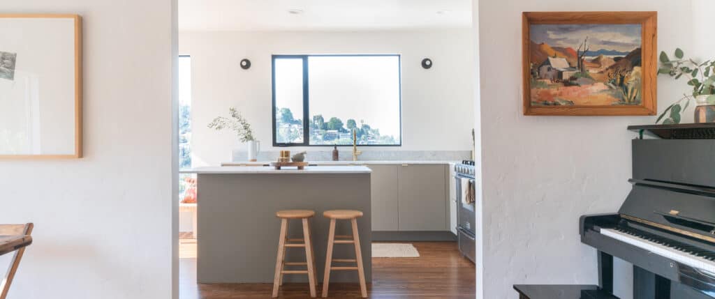
Four months later, Marcus’ cookspace was nearly unrecognizable — she ripped out the flooring, faux tile countertops, upper cabinetry, and a partitioned wall in favor of an oversized island and sweeping hillside views. Ahead, she reveals how she lightened and brightened the dated space.
Reconfigure the Layout
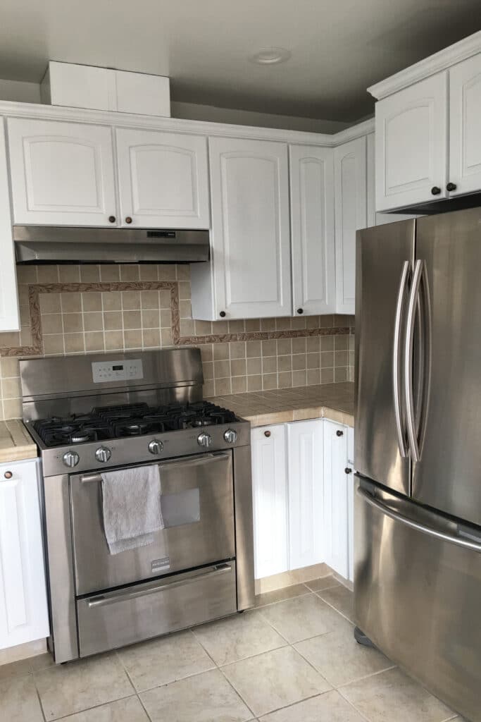
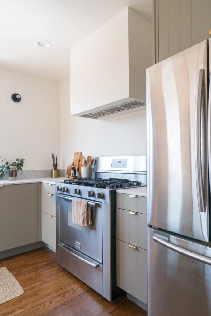
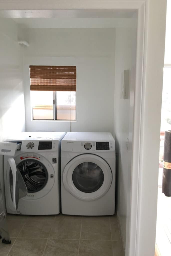
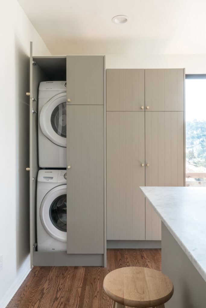
Marcus describes her original kitchen as “mediocre at best,” noting the dim lighting, lack of seating, and cramped layout. “There was literally a random laundry room behind a partitioned wall in the middle of the kitchen,” she explains. “Removing that wall was a total game changer — it made the space so much more functional and made room for the large center island.” Marcus and team also widened the entryway and moved the refrigerator to the back wall to create more of an open L-shaped layout, as opposed to the original U-shape.
Design by Lindsay Marcus; Photography by Bethany Neuart
Widen the Windows
With the help of an experienced contractor, Marcus widened both of the west-facing windows to roughly five times their original size. “We made them as large as possible without compromising the structural integrity of the house,” she shares. “It was a lot of work, but so worth it — the additional lighting really changed my entire house.”
Brighten the Color Palette
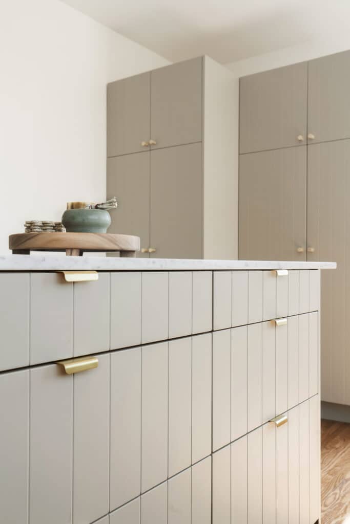
To further brighten the space, Marcus kissed her beige tiled countertops and cumbersome upper cabinetry goodbye. “Taking down the uppers in favor of clean white walls made a huge difference,” she shares. Bright calcutta marble countertops and Semihandmade Desert Grey beaded fronts helped Marcus achieve the calming atmosphere she was going for. “I really wanted to create a relaxed, inviting space, and the muted Desert Grey hue was perfect.”
Add Warm, Organic Touches
Marcus describes her kitchen as “organic modern,” thanks in part to the natural, warm details like the jute rug, decorative cutting boards, wooden bar stools, and unlacquered finishes. “I see the unlacquered brass faucet as a design centerpiece of the kitchen,” she notes. “It was a splurge, but it’s the first thing you see when you walk in, and I really wanted a beautiful, living finish.” She also sees the beaded fronts as a subtle graphic element. “They add just the right touch of texture and dimension, while staying true to the modern aesthetic.”
More Stories...
The space is decked out in Semihandmade Moss Quarterline and Tahoe.
House flippers and mom-daughter duo Lacey and Audrey Soslow created the kitchen of their (buyers’) dreams.
Malene Barnett teamed up with designer Leyden Lewis to create a space representative of her work.
Comments (1)
Can you share which Ikea cabinet was used to hide the washer/dryer? Thanks!