Amber Sokolowski wasn’t deterred by all the dark brown finishes in her 1960s Southern California home—she saw it as a challenge.
When the interior designer moved in four years ago, the house lacked charming period details. “It’s a tract home without any real distinct style,” Sokolowski explains. “There were no strong influences.”
With this blank slate, the Soko Design founder had free reign to reimagine the space for her growing family. Her first order of business: update the dark floors with light engineered hardwood to brighten everything up. “Before, they had a faux hand-scraped look,” she recalls. “Removing them was my top priority.”
Saying Goodbye to All the Brown
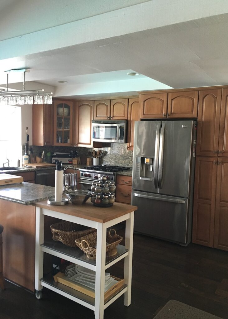
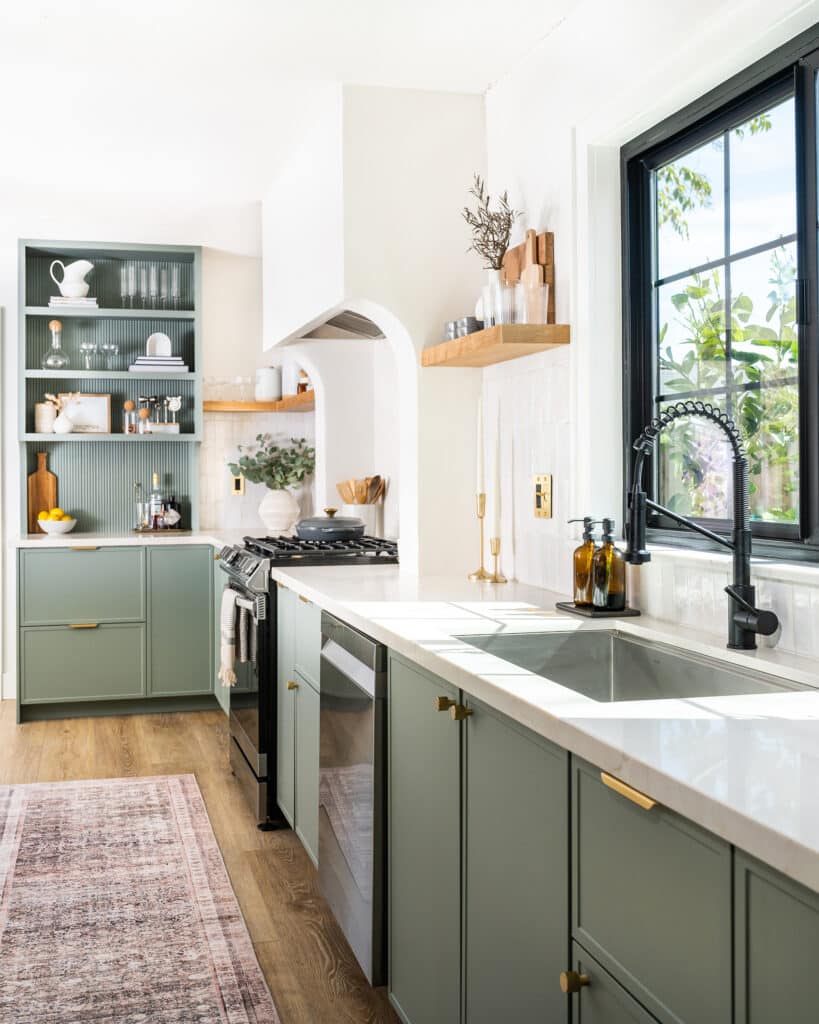
The original kitchen was covered in shades of brown.
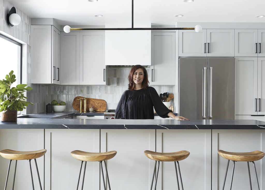
West Elm stools pull up to the peninsula for casual seating.
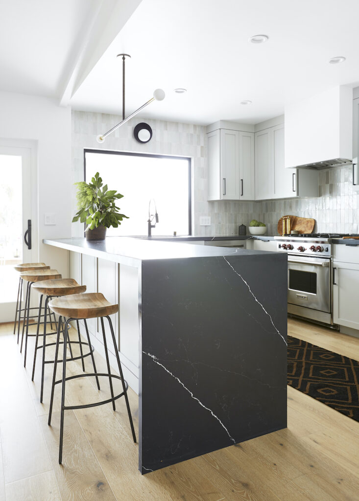
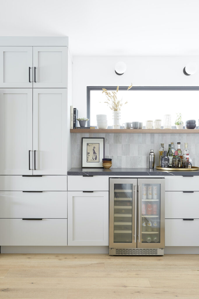
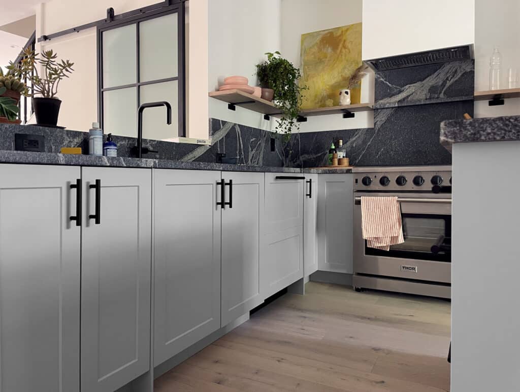
The old kitchen also got the boot. Though the original layout was fairly functional, the bulky cupboards and brown granite countertops did not match Sokolowski’s vision. She swapped them for dove gray shaker cabinets with matte black Schoolhouse hardware and Qortstone black quartz countertops with a waterfall edge. “I wanted to do something really dramatic,” Sokolowski says. “I like that it’s honed and not polished. It’s soft and doesn’t have that high shine.”
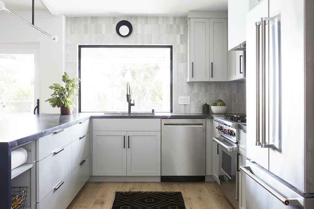
For the backsplash, Sokolowski picked a rustic, imperfect rice paper-hued Clé Tile. A showstopping, linear pendant from Allied Maker completes the cool-toned look and combines the various metal finishes in one structural focal piece.
Blocking Out the Neighbors (But Letting the Light in)
The long Semihandmade floating shelf and its contents are backlit by a frosted window.
The kitchen flows seamlessly into the bar area, which includes a tucked-away coffee station, a Zephyr wine refrigerator, and a Semihandmade walnut floating shelf where Sokolowski displays ceramics and books. Behind the shelf, she cleverly installed a frosted window to impede the view into the neighbor’s house (while still welcoming in the natural light).
“I thought the blurred effect was a little bit risky, because it’s not something you typically see in a kitchen,” Sokolowski says. But the designer knew it would glow behind all her pretty objects, creating a backlit effect. “It’s a really cool, standout feature and I’m really happy with the way it turned out.”
Getting Graphic With Tile
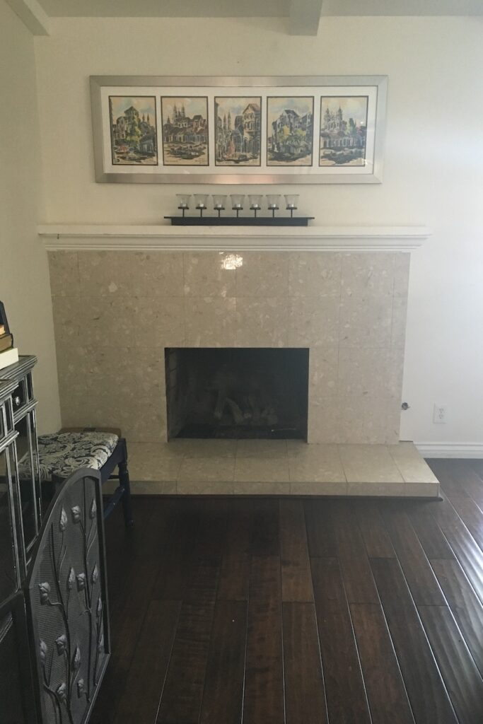
The original fireplace was covered in shiny beige tiles and the floors were dark with a faux hand-scraped look.
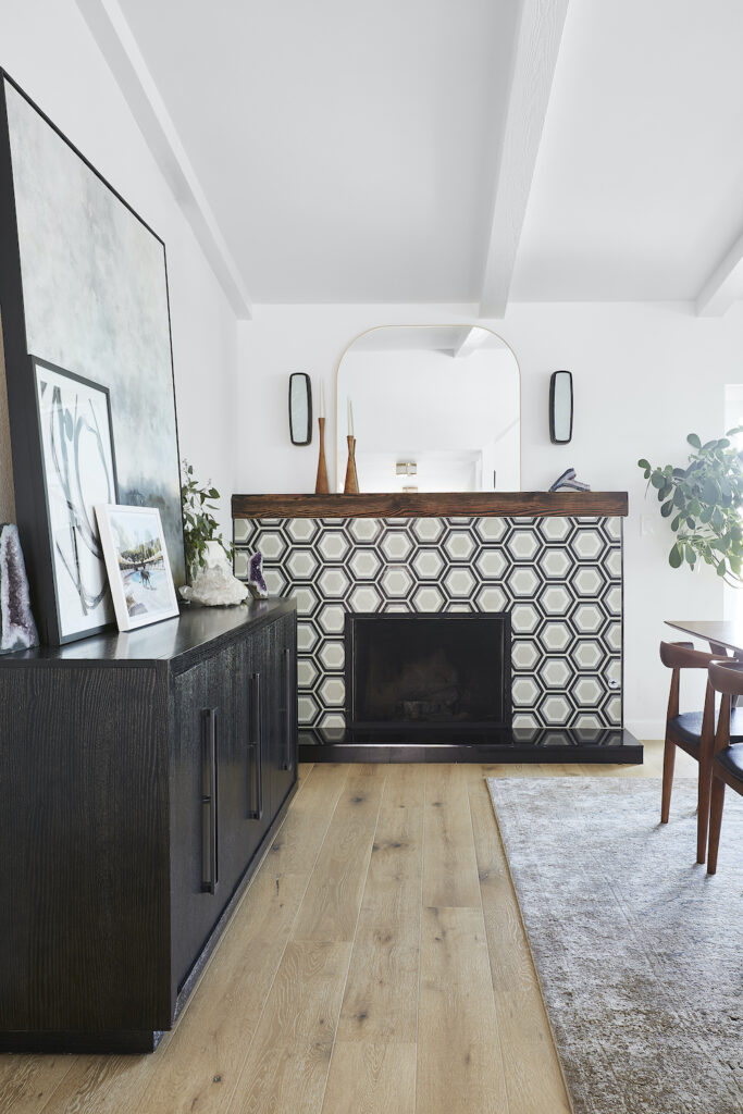
Now the fireplace is punchy with graphic black and white tile and Kelly Wearstler sconces.
In the nearby dining area, the fireplace (once covered in glossy beige tile) is now eye-catching thanks to a bold, hexagonal pattern from Cement Tile Shop. It’s topped with a restored railroad tie mantel crafted by Sokolowski’s friend and flanked by Kelly Wearstler Utopia Sconces.
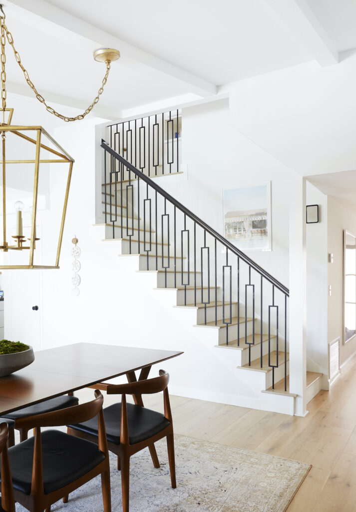
On the opposite wall, an equally graphic treatment runs up the stairs by way of a rectangular motif on the new railing, which Sokolowski devised to replace the existing white one. “I liked the idea of rectangles because that shape repeats itself so often in our kitchen and dining room that I thought it would be a nice complement,” she explains.
Keeping One Detail for the Kids
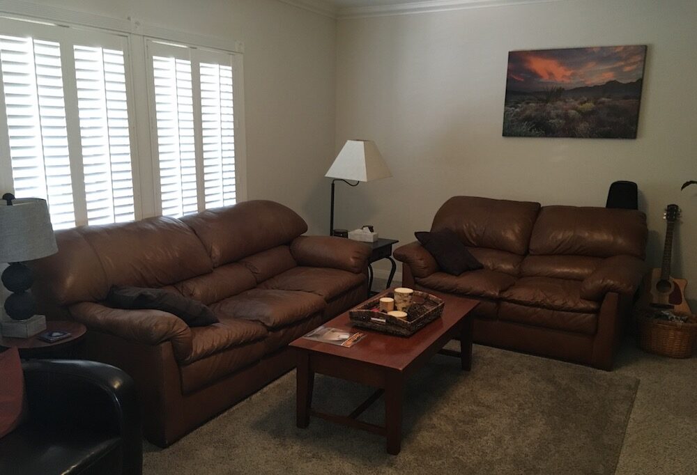
Sokolowski kept the living room carpet for now, but plans to put in hardwood when her children are older.
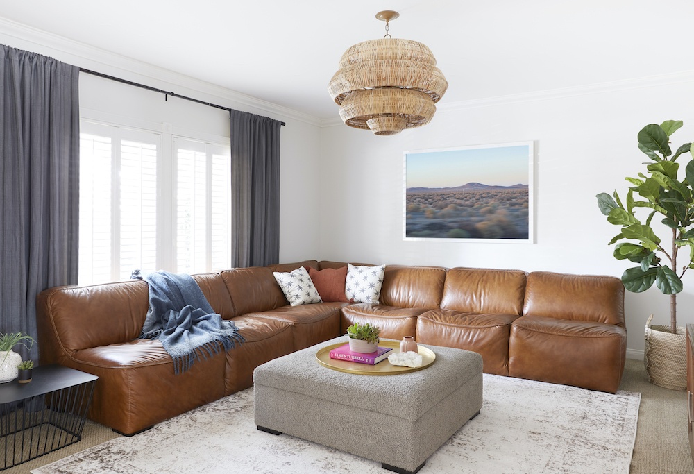
“We got a leather couch because it’s super durable with little kids, compared to fabric,” Sokolowski remarks. A beehive-like rattan chandelier hangs above.
There’s still one work in progress: the living room, where Sokolowski redecorated economically. She kept the tan carpeting, which provides a soft surface for her young children who are learning to walk, and covered it with a faded Persian rug for now (it’ll one day be replaced with matching floorboards). Instead of creating built-ins, the designer bought and styled inexpensive bookshelves. The toddler-friendly ottoman, which holds toys, and the L-shaped sectional are both from Living Spaces. “The living room is just super budget,” Sokolowski admits. “I just wanted to get a couple of things that made it pop.”
More Stories...
The space is decked out in Semihandmade Moss Quarterline and Tahoe.
House flippers and mom-daughter duo Lacey and Audrey Soslow created the kitchen of their (buyers’) dreams.
Malene Barnett teamed up with designer Leyden Lewis to create a space representative of her work.